


On Monday I paid a visit to the ISM, Europe’s biggest trade fair for sweets, chocolate and snacks.
Though still majoring on candy, chocolate and ‘fine bakery’ products, ISM’s marketing noted that it had ‘expanded its offer to include current nutrition trends in the snacks sector and further products for in-between snacking enjoyment’. These included fruit & vegetable snacks, smoothies, fish & meat snacks in ready to serve packaging, energy & fitness snacks, breakfast snacks, coffee and tea and ‘confectionery at all temperatures’.
Despite this promise of current nutrition trends and a dedicated new product showcase area, it was pretty hard to spot the ground-breaking trends that will change the way we treat ourselves to a sugar, fat or salt hit (or all three together) in the future.
But this is perfectly normal – new products don’t replace the old ones overnight, or even in a year. Instead there is a slow evolution of tastes and nutritional profiles that could (eventually) change the landscape of the category out of recognition. That means it’s a good idea to scan the hundreds of stands from producers large and small, local and exotic, to try to spot the next big thing while it’s still barely visible.
So get out your magnifying glass and follow me…
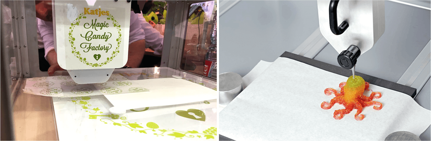
Self-made
If they can 3D print a working gun, then it can’t be a big deal to make some candy, can it?
Well the technology is a bit small-scale and slow at the moment, so you’ll have to wait a while if you want a whole bag of sweets. But that’s not the point: it’s the very thought of making your own food design and seeing it come to life in front of your eyes that will drive consumer fascination in this space. It’s exactly like the early days of mobile phones or the internet: A phone the size of a house brick but without a cord was still mobile, and a dial-up connection to the information superhighway was still a portal to another world.
Katje’s Magic Candy Factory was a big hit with visitors simply because we’re all hungry for more and more digital technology in our lives. Where ‘food printing’ will lead is a big unknown, but just as the space race gave us satellite TV and ear thermometers (yes, honestly), you can be certain that just the fact that it can be done will unleash some powerful creative forces.
Just a note of magical caution from an industry insider: ‘The foods printed by these machines aren’t always the prettiest, but are we starting to see the actual beginnings of the food printing market? Or is this more marketing sugar designed to lure investors and customers into the 3D printing hype oven? Like the original German version of Hansel and Gretel, we may not know until we’re already being devoured by witches’.
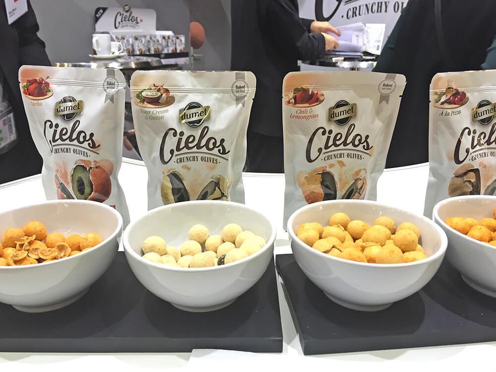
Crunchy Olives
Whilst 3D printing is clearly a trend that the world and his wife is watching closely, it takes a special kind of visionary to imagine a product type that no-one thought would work. And then in the face of considerable skepticism go make it anyway.
Crunchy Olives are not, as might be imagined, just olives that they left the stones in. These are olives with a crispy savoury coating, in flavours which their Swiss inventor seems to have borrowed from Lay’s. Nothing wrong with that as long as they taste great with the right type of olive inside, and for my money some of them actually worked. The texture combination takes a bit of getting used to, but the producer has found that they have the merit of appealing to ‘people who don’t like olives’. I like the fact that he’s given them a brand name too, though I’m not sure if ‘heaven’ is the metaphor I’d have chosen. This idea might need a bit more WTF factor.
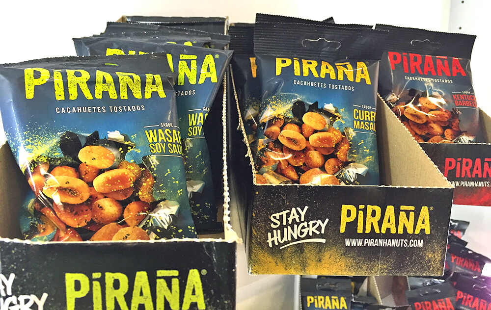
They’ll bite your hand off…
Can’t remember now if Piranas really can eat people alive in 20 seconds, or if they only do that in horror movies. But this little brand innovation grabbed my attention because of the power of the name to raise the energy level of the shopper. When the name does so much of the framing, the designer’s task is a creative pleasure: How to fit the specific product characteristics (in this case spicy peanuts) into the story already triggered in my brain. The bursting foil and the ‘splat’ of flavour codes delivers that in spades, and I’d bet that that cool blue colour has something to do with the watery habitat of those mean killer fish too.
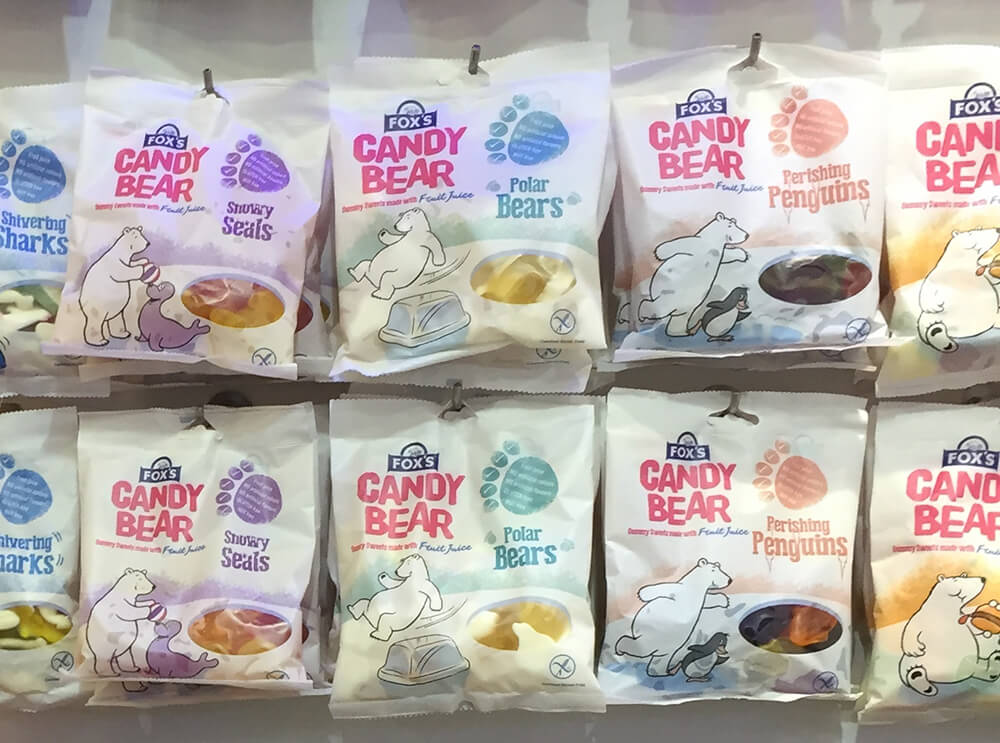
Ice cool candy
When I was a kid and advertising was still at the top of its game, the campaign for Fox’s ‘Glacier Mints’ featured an argument between the bear (the brand symbol) and a fox (who thought he should be the brand symbol). Clearly the bear won (because the product was “So clear and cool and minty”).
Now new brand owners Raisio have really recognised the power of an asset by naming their entire confectionery division ‘Big Bear’, and also revamping the Fox’s brand with an expanded range of hard candies and this new range of chewables. The Arctic theme provides a playground for the aforementioned Big Bear but also creates a soft, white world that signals the lower sugar and less artificial trend in this category (details available in the paw print). And you’ve just got to admire the product reveal window being a hole in the ice. A strategic and design delight.
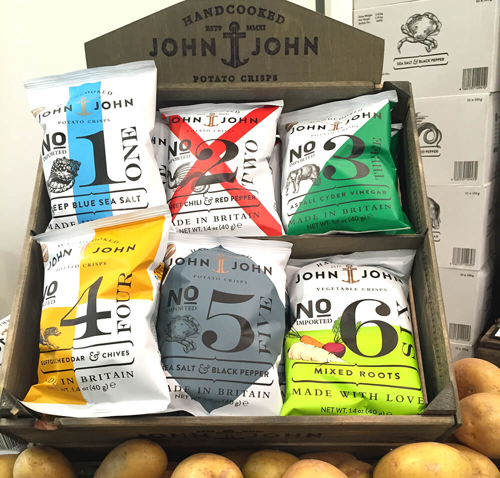
British by design
“Not another handmade British crisp!”, I hear you say, but hold your Shire horses a moment. This award-winning packaging was created by a rather unusual German company, who identify food trends and then create (and design) their own brands to compete. So you won’t find ‘John and John’ in the UK, where it would be up against another thirty land owners turned brand owners.
This is a brand crafted for the rest of the world, trying to follow in the footsteps of Tyrrell’s. That brand is worth studying by itself, for its clever ploughing the furrow of the ‘British eccentric’ story for all it’s worth. That has created a clear (and global) position in the consumer’s mind by adopting a famous cliché – a fast track route to success in my book.
Being made-up by marketers and designers, John and John’s back story isn’t quite as authentic as Tyrrell’s: Allegedly two friends ‘from a small town in southern England, John Farmer produces the world’s finest potato crisps’, whilst ‘the other John, John Sailor, travels the world in search of new and extraordinary spices…’ That made me laugh, in the same way ‘The Office’ makes me laugh, cringe-worthily.
But despite breaking one of my big branding rules (‘find the truth and tell it with style’), the designers almost get away with it, combining a raft of traditional typographic, illustrative and layout clichés from a non-specific yet recognisably British past. It’s the kind of graphic style much favoured by faux-gentry British fashion retailers, so I’d advise them to go sponsor ‘Made in Chelsea’, or similar.
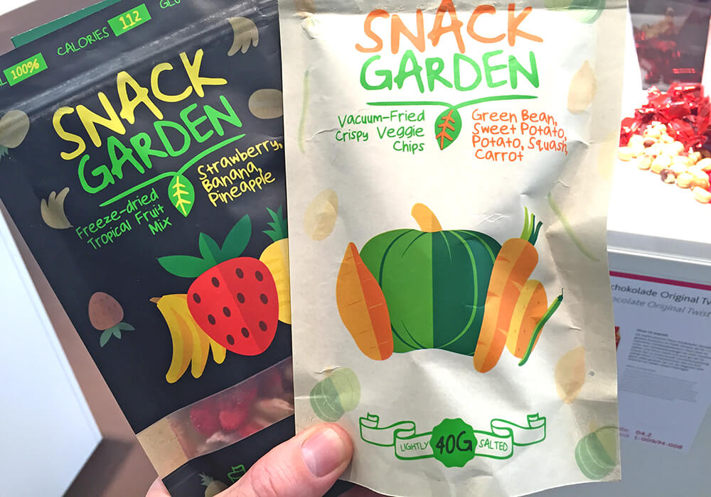
Feeling Hungary?
Here’s a new product looking for potential distributors in Europe right now, so pass this on if you know one. The brand creator (Ivan, contact him at ija@snackgarden.eu) wasn’t exhibiting at the show but walking around talking to people instead. Having thrown a suit on for the occasion, I must have looked like the kind of guy who knows distributors. Not really, so over to you.
Ivan’s product was accurately depicted and described as ‘Veggie Chips’, yet I was still expecting the usual copies of potato chips / crisps. These are actually much chunkier and more like peeled, chopped veggies. The pack on the right (no window) is technically necessary for preservation, so I suggested it might be worth a more accurate representation of what’s inside. Physically, however, the stiff paper-feel bag with a zip seal built-in is spot-on, exuding quality and natural cues. Maybe the ‘brown paper bag’ of the Grocer’s shop might make an even better metaphor.
I also like the name – somewhat descriptive but full of potential to create a big brand story online.
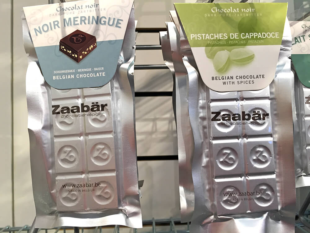
Can stories exist in a vacuum?
I was drawn to the Zaabär stand by some very attractive cardboard packaging which only revealed its secret upon opening: A folded carton with two separate portions of vacuum-packed chocolate (one on each side), which allows consumers to snack responsibly on one small portion whilst keeping the other fresh for later. Available in dozens of exotic flavours, it offered a veritable bazaar of fragrances and tastes.
The more intuitive of you will have already spotted that the brand name is an anagram of bazaar, so this is far from a coincidence. But does chocolate need to be vacuum-packed at all? It’s not a deeply-felt consumer need, but it could be encouraged with the right story, such as the need to preserve the more ethereal flavours like violet and saffron.
Further along the stand I encountered the vacuum-packs exposed under a simple sleeve. Somehow the space-age silver wrap, with the ‘Z’ mark so tactile on the surface, conjured up something very precious. But the unbranded and generic card sleeves above did nothing to build this story, and the opportunity was lost. They’ve been making this chocolate for nine years, but with the right story maybe it has found its time?
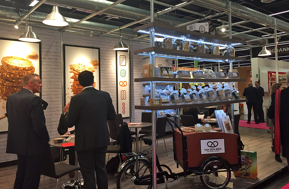
Crafting the story
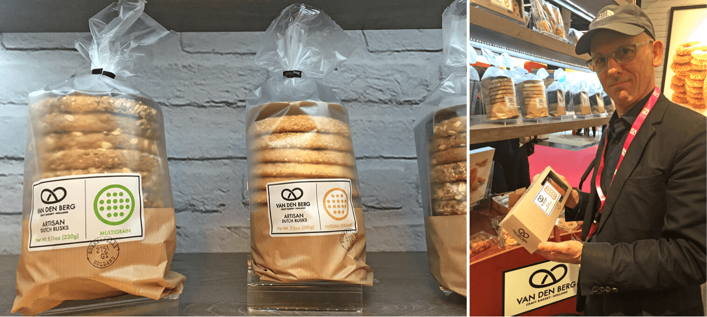
This is our own work for a successful baker in the middle of Holland – Peter van den Berg. Half the reason for my visit to ISM was to checkout the stand we had designed for the show, and it was well worth the trip. Buzzing with Buyer activity and collecting visitor compliments for the branding, packaging and the stand design itself, it should propel this newly created brand to big success. Checkout our design story here.
Peter’s products were already great, but hidden from the spotlight in the packaging of his Private Label customers. Having been advised by my old friend Derk de Vries to create a brand, to highlight the inherent quality of his crackers, rusks and traditional sweet biscuits (and to provide an additional revenue stream for the business), Peter took to the project like a duck to water.
He was also decisive in selecting the design concept to capture the true brand story of four generations of baking expertise. We called him a ‘Dutch Craft Baker’, which seemed natural to us but doesn’t have a direct translation in the Dutch language (where ‘ambachtelijk’ is over-used to describe any product made with care or in an ‘old style’). Taking our inspiration from ‘new craft’ language, we combined traditional san-serif typefaces, a bold black and white colour palette, and brightly-coloured graphic icons to represent the product range. One icon is elevated to the status of brand symbol, this being based on Peter’s Great-Grandfather’s signature product (a unique recipe for ‘Krakeling’, still used today).
The stand design is an ‘homage’ to Peter’s factory, complete with scaffolding shelves, live dough-making and baking, and some eye-catching industrial air-ducts. It’s theatre, and it’s selling!
This post has been published in Dutch: goo.gl/abwTq1
This post has been published in Spanish: goo.gl/CZQuM0