


The story of the discovery, cultivation, trading and global adoption of coffee is a long and fascinating one but not, you’ll be pleased to hear, the topic of this article. What I’m interested in is which part of the story gets told on coffee brands’ packaging, and why? More importantly could we do better, and what might that look like?
As always with packaging, the question we really need to ask is a semiotic one: ‘which aspects of the story behind coffee act as signifiers for the needs of consumers?’
Why on earth would people looking for a morning pick-me-up or a dark, rich digestif care about where in the world the beans grew? Or how it was roasted? Or which brand it comes from? As it turns out brand and place are intimately linked, but not as you might think. Before unpacking that let’s take a look at the stories:
Origin
Ask consumers to name the places where coffee comes from and you’ll hear the usual suspects: Brazil, Columbia, Kenya, Ethiopia, Costa Rica, and perhaps a few other South American countries. You’re less likely to hear the world’s second largest producer Vietnam on that list, but in the end the specific origin is not that important from a brand perspective. Tesco, Albert Heijn and Mercadona all have plenty of exotic blends too.
Coffee packaging designs that reference exotic and tropical places give what’s inside an image of mystery and allure, but it certainly won’t differentiate one brand from the next.
Fairtrade Coffee Packaging
There is a second story around origin, which is about centuries of trading. In truth this ‘trading’ was often better described as colonisation and exploitation, a story whose flip side is Fairtrade, a successful and growing brand in its own right. But by definition Fairtrade and similar organisations want every brand of coffee to adopt their principles, largely ruling it out as a differentiator.
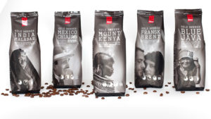
Brands in the Fairtrade space often featured exquisitely produced portraits of the hard-working local beneficiaries, with some fine (and rare) examples of people on packaging done well. But as the benefit has become widespread and expected, the farmers have faded from view.
Heritage & Craft
To get to differentiation and added value, the province of true brands, we need to take the next step in the process: Getting the coffee to its point of consumption and what happens there. Here we find rich sources of imagery and storytelling: From the ports where the raw materials first landed, to the roasting and blending houses, to the places where people gathered to drink this new found ‘black gold’ (there’s a brand name in there somewhere).
Here we encounter coffee’s original merchants and expert roasters and blenders, people like Douwe Egberts, Johann Jacobs and Luigi Lavazza. Such brands can tell stories of the passion and craft of founders and their descendants over one or two centuries, using the visual language of trade marks, coffee ‘hardware’, special recipes and original packaging materials.
But with many of these family firms having long been absorbed by multinationals, there’s a growing number of first and second generation start-ups with (possibly more authentic) passion and craft stories to talk about on their coffee packaging. Like their compadres in tea blending, beer brewing and distilling, these challenger brands adopt a more ‘gutsy’ and handmade visual language, echoing the very personal, small-scale and ‘immediate’ making of the product.
Community

For many of these new players there is a powerful reason to believe their packaging story, in that the brand was originally encountered in a coffee bar, such as Starbucks or Costa. For more bleeding edge consumers there’s a plethora of hipster ‘coffee roaster’ bars pushing the envelope of retail authenticity in the same way that microbreweries trump ‘pubs’. Echoing the achingly cool sensibilities of their customers, these companies work with branding agencies, to produce packaging that goes to enormous lengths to be seen to be not trying. Available in black or taupe.
But underneath the fashion statement there is a powerfully authentic story of a deep human need for like-minded companionship, and it’s this insight that has driven Starbucks to such enormous success with what is, in truth, average product quality.
In Starbucks’ own words: ‘Back then, the company was a single store in Seattle’s historic Pike Place Market. From just a narrow storefront, Starbucks offered some of the world’s finest fresh-roasted whole bean coffees. The name, inspired by Moby Dick, evoked the romance of the high seas and the seafaring tradition of the early coffee traders.
In 1981, Howard Schultz (Starbucks chairman, president and chief executive officer) had first walked into a Starbucks store. From his first cup of Sumatra, Howard was drawn into Starbucks and joined a year later.
A year later, in 1983, Howard travelled to Italy and became captivated with Italian coffee bars and the romance of the coffee experience. He had a vision to bring the Italian coffeehouse tradition back to the United States. A place for conversation and a sense of community. A third place between work and home.’
Viva Italia
The captivation of Howard Schultz tells us a lot about the real power of place in coffee branding and packaging.
As the exotic liquid travelled from its Arabian origins through Turkey and Italy to Europe, America and beyond, one place in particular stands out as the ‘home’ of coffee, and one glance at both brand and product names on the supermarket shelf will tell you which one.
Yes there are a few brands that were actually born in Italy, but these are far outweighed (except in Italy, clearly) by dozens of wannabe Italians from the rest of the world’s manufacturers.
The Guardian blog summarised the reasons behind this perfectly: ‘Other brands may not have Nespresso’s boutiques, but they’re all selling a lifestyle. Look at the names: Senseo, Tassimo, Verisimo. They all sound jauntily Italian, as if with one touch of a machine bought in Argos, the owner becomes a Milanese sophisticate.’
At your service
There’s a lot to like about the Italian lifestyle (just ask olive oil), but the hottest trend in the market right now is all about coffee pods and machines.
Just as Apple reinvented the mobile with the iPhone, Nespresso has changed the world of premium coffee, smartly adopting the codes (including distribution channels) of an exclusive club. The machines and their iconic colour-coded capsules have become a metaphor for the lifestyle of the rich and famous; the flagship ‘boutiques’ echoing the styling and service of fine restaurants and five star hotels.
As Declan McClelland points out in his insightful blog: ‘Many aspects of Nespresso’s marketing mythologise and ritualise the coffee drinking process to absurdity. Then again, wine and whisky experts are equally pretentious, so why shouldn’t Nescafé jump on the bandwagon?’
Why not indeed? Pretentiousness sells.
This phenomenon has enabled the mass market to shift rapidly to three- and four-star versions of the Nespresso concept: More affordable machines and capsules/pods that promise an ‘instant’ product of high quality (or at least much higher quality than a spoonful of freeze-dried granules).
The battleground is especially interesting in the UK because instant coffee still accounts for over 75 per cent of home consumption, as opposed to well under 10 per cent in the U.S. and France, and one per cent in Italy. According to Mintel Britons spent £56m on pods between February 2012 and 2013, up 45% year on year, driving the UK market at the expense of ‘traditional’ instant coffee. In other markets similar growth will be coming at the expense of roast & ground formats.
Back to Black

Putting aside something as prosaic as format for a moment, it’s the pure liquid itself that holds perhaps the most powerful story of all. Coffee is, or rather contains, the world’s most widely consumed psychoactive drug – Caffeine. It produces increased wakefulness, faster and clearer flow of thought, increased focus, and better general body coordination.
As consumer needs go, that’s a pretty good list right there, but from a coffee branding and packaging design viewpoint, what encodes these benefits?
Given that it’s also the colour of the concentrated product, black will do nicely. In Western cultures black often denotes negative outcomes (including death), but it also denotes strength and authority of those who embrace it. Many ancient cultures believed that black was ‘the colour of the mysterious ways and wisdom of God’. This was because darkness transcended human perception in the same way that the wisdom of God was thought to be beyond comprehension.
All in all, this seems to add up to a great code for something that mysteriously enhances performance of mind and body.
Seven stories, but which are the winners? The answer, or maybe more questions, can be found here. Get in touch with a member of our team to learn more.