


I’ve written frequently on the subject of so-called ‘craft’ brands springing up everywhere. According to packaging design website The Dieline, such brands are harnessing a trend towards ‘visual authenticity’ in their design language.
The Dieline’s founder Andrew Gibbs coined this term recently and defined it as: ‘a real, trusted, human connection to the products and the brands that they consume. This connection can be expressed in different ways, from a connection to nature, to the written word, to the past, or simply to other people. This is beyond hipster. This style is a rejection of technology; a pre-computer era style, if you will.’
But exactly how is this historical brand language affecting the design codes of established brands? Strap yourself into Doc Brown’s DeLorean and let’s go Back to the Future to find out…
Made by hand
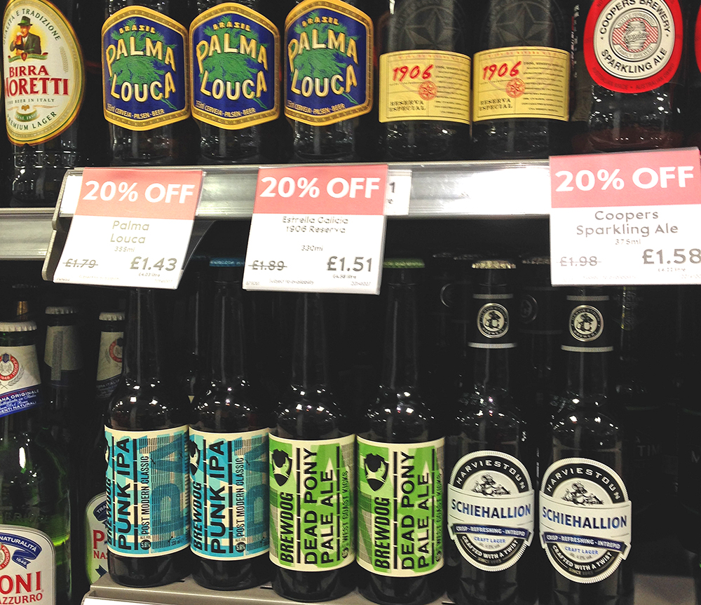
In 2014 Brew Dog transformed their 7 year old ‘punk rock’ labels to something almost completely different. They went from ‘rebel’ to pillar of the (craft beer) establishment overnight and got away with it. So put down your business-school books on re-positioning strategy and read how it’s really done:
‘When we set out to change our packaging, we did so with one aim in mind – to create packaging that better reflected the beer we make. That meant focusing ruthlessly on two things: quality and craft.
We’ve done that by stripping the design process back to basics. By going to one of the UK’s few remaining letterpress studios to hand-print our designs using 100 year-old metal and wood letter blocks.
By moving to a thick, uncoated paper and by applying layers of ink with as much personality and character as the beer inside the bottle. And we’ve embossed the labels so they feel awesome in your hands. It’s time for our packaging to become as hand-crafted as our beer.’
All fine and dandy but someone had to create an appropriate brand graphic identity. The result seems comparatively sober after the shock of the original incarnation. But looking closer (as you are bound to do as you caress that thick, uncoated, embossed hand-warmer of a label), the design’s big idea hits you. It’s the old-school Printer’s multi-layered ‘test sheet’.
Designers older than 35 knew that already. Hint for Gen Z or whatever you’re called this week: It’s not a filter in Photoshop.
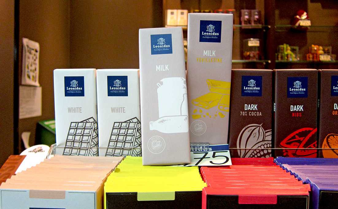
The remarkable thing about Belgian chocolate brand Leonidas’ packaging is the contrast between the ornate and traditional style of the 78-year-old logo, and the simple line work and stamp effect print of the illustrations. With most Belgian chocolate brands seemingly stuck in the pomp and circumstance of being a Belgian chocolatier, this humble yet elegant style comes as a welcome surprise.
It tells me a story of a master craftsman working with very pure and simple ingredients, which is pretty much what we want from a brand today, isn’t it? Not all the variants work as well as the best ones, but nevertheless it got me to try what I’ve always thought as a stuffy and old-fashioned praline brand.
How does packaging achieve this?
The reason is simple: Our brains’ impulsive System 1 can’t help but jump to the conclusion that crafted packaging = crafted product (this is called ‘Sensation Transference’). So if the pack looks hand-made, or hand-decorated, then we are inclined to think the product has been too, however much the rational (System 2) part of the brain knows this to be unlikely.
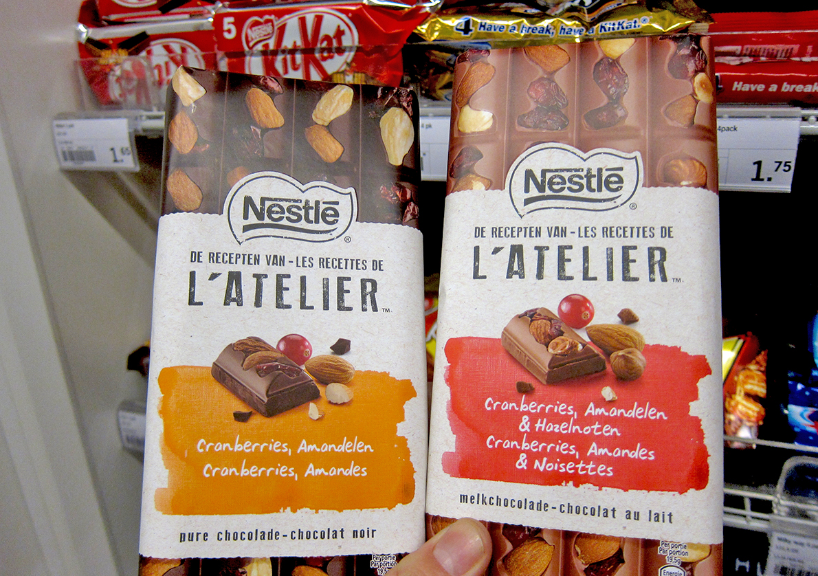
Named after an artist’s studio or workshop, the craft pretensions of this new range from global giant Nestlé are boldly stamped onto its matt paper banderol effect.
The sub-brand typeface is true to a period of basic letterpress printing, and the stamp effect (which includes the Nestlé logo – bet that wasn’t in the guidelines) has just the right amount of printer’s ink missing to feel authentic. A vivid brushstroke of variety coding seems to have been applied by a watercolorist’s brush.
As for the product itself, it may be that this feature of ‘open-top’ ingredients peeking through is a traditional chocolatier skill that I am unaware of. But I admire the tenacity of the production team who found a way to imitate individuality of each piece, using a process previously dedicated to conformity.
I could be picky about the numerous clues that this design is ultimately pure pastiche, but that would miss the point. This is ‘craft’ chocolate for the masses, and a great example of the blending of codes that I expect many major brands to adopt, to capture at least some of the craft wave.
So what are craft signals?
There are very many ways to skin this particular cat, but you’ll be (increasingly) familiar with the usual suspects. As I suggested in a recent Linked-In article: ‘we are seeing all the big brands falling over themselves to drop their photoshop fantasies of perfect products, and get out the pencils, stencils, blobby paintbrushes and rubber stamps’. I should have mentioned perhaps the most powerful tool for instantly conjuring up the (craft-based) past: Typography.
The craft of printing evolved slowly throughout the 18th and 19th centuries, focused as it was almost entirely on book printing. But as mass production of consumer products grew quickly towards the end of this period, so did the need for mass communication and with it, branding.
Typographers and engravers sought to innovate with new typefaces and illustration styles, and brands tried to differentiate themselves with unique combinations of the available fonts and images. Since this era was also pre-psychological insight, the substance of differentiation frequently involved long-winded claims and images of the Purveyor’s shop front or signage; later this evolved rapidly into symbols and metaphors, the precursors of what we know today as brand assets or brand equity.
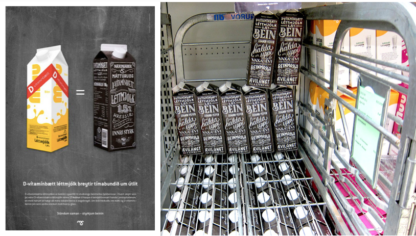
My first thought on seeing this milk fridge (plus infographic poster) in an Icelandic supermarket was that I had chanced upon the most radically-redesigned pack in history.
In most countries Milk is sold via very clear colour codes, for full-fat, semi-skimmed, homogenised, etc. Why would anyone change a yellow pack with a bold red stripe (communicating the addition of D Vitamins) into a black chalkboard covered in text, written in 10 different antique typefaces? Was it now flavoured with Jack Daniel’s?
Two clues: The black pack isn’t on the website of brand owner Mjólkursamsalan Dairy Co-operative, and it was created by an advertising agency. After much Googling around, I worked out that this is a promotional pack to raise funds for a new bone density scanner, to help address Osteoporosis in Iceland’s senior population.
Of course the use of old-fashioned poster graphics isn’t aimed at the seniors – they are all too young to remember anything as archaic as this. It’s firmly aimed at the younger market who can stand it next to the cornflakes and think how cool fundraising can be, when it looks this good.
The power of the past
Most European countries have a heritage brand of chocolate milk, with an enviable position in the consumer’s mind as their first memory of the intoxicating taste of chocolate.
That makes nostalgia part of their DNA to some degree, which allows them to fuse the past and the present more seamlessly than brands in many other categories. This is often expertly communicated in both packaging and advertising, as these two examples show.
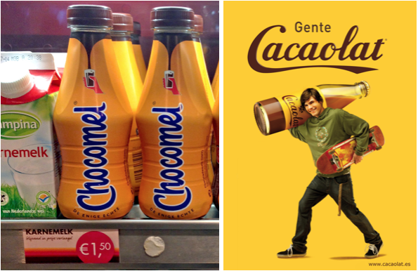
Chocomel’s on-the-go bottle looks bold and bang up to date yet full of rich heritage. This is largely due to the consistent use of its rich, flat orange-yellow colourway, but the delightful retro styling of the hand and glass motif adds extra credibility.
Meanwhile Spain’s Cacaolat has revived old bottle forms and graphics for its packaging, and has also brought back some famous advertising imagery featuring people carrying a giant bottle on their shoulders. The people have changed a bit, but the message remains clear: ‘As good today as it’s always been’. That’s a communication objective that all established brands should want to include in their next brief.
A material difference
The form and material of packaging is by far the most effective storytelling tool in the designer’s box. It needs no words to instantly send the brain’s system 1 to the right place and time. This is easy to appreciate when dealing with form-rich packaging like the Coke bottle or Bonne Maman’s ‘visual proverb’ of a jam jar.
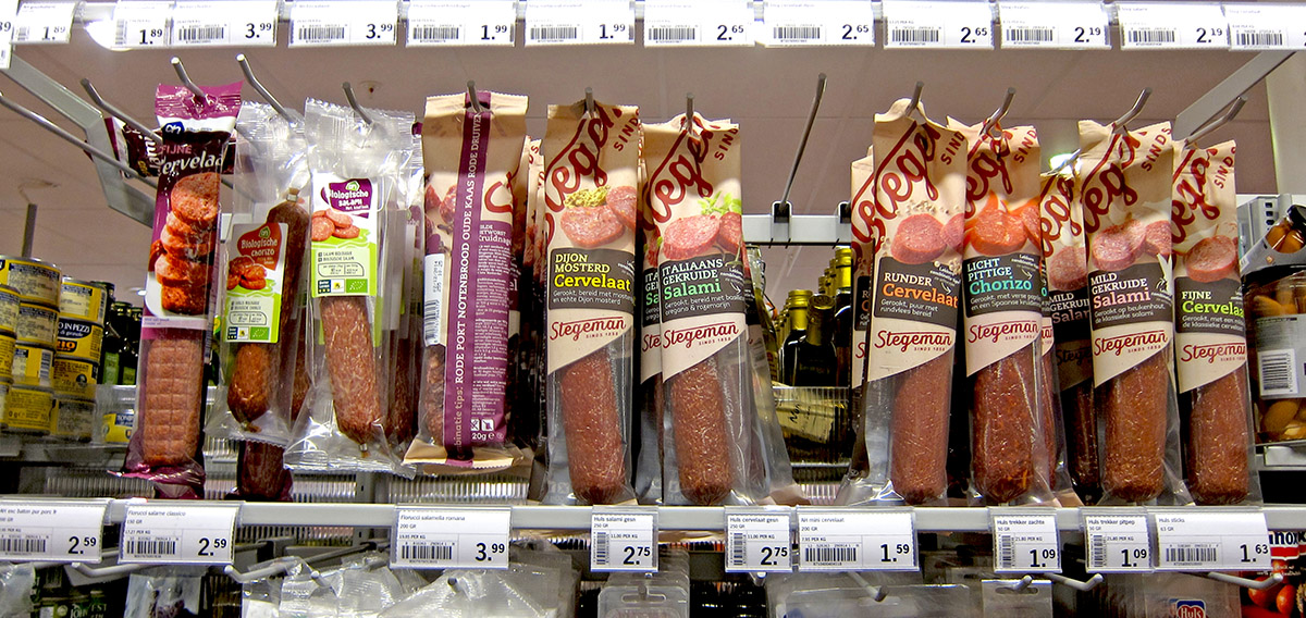
To achieve it in sausage and sliced meat packaging is another level altogether, but Holland’s Stegeman has always gone the whole hog when it re-considers its packaging design. This latest incarnation has reinvented plastic foil as utterly convincing ‘Butcher’s paper’. You really need to feel it, but it’s also supported graphically by the true colours of the butcher’s shop: Pinky-buff and oxblood red. Bright coding colours on a black panel simulate the chalkboard display to complete the story. Meaty stuff!
When the store is the story
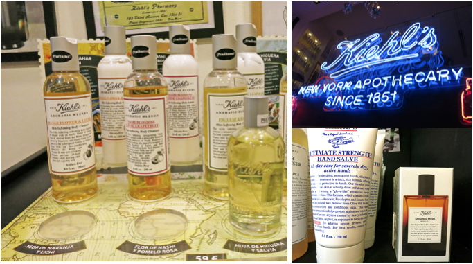
Welcome to Kiehl’s New York Pharmacy (Madrid branch).
In the theatrical setting of your own beautifully designed retail space, with no competitors in sight, packaging can forget noisy neighbours and really get into character. In this case that calls for an all-American script logo, old-fashioned typesetting with crude underlining, and a (very) long product story that would be at home in a 18th century pamphlet for snake oil: ‘The genuine article and guaranteed cure that relieves everything instantaneously’ kind of story.
Actually the technique of imagining the perfect store can be very helpful to conjure up the right packaging story. And a quick look at the prices in Kiehl’s will convince anyone that it certainly cures ‘bottom-line ailments’.