Who put a gun-toting alien on my beer can?
It’s a cliché and a truism to point out that the world is in a constant state of rapid change. But this is a relatively recent phenomenon, fuelled by technology. Just stop to consider the scientific, societal and economic advances of the last 250 years, and it becomes clear that nearly all the comforts and pleasures of modern life simply didn’t exist for most of human history.
As Hans Rosling pointed out in his famous book ‘Factfulness’, the average life expectancy of a Swedish man in 1820 was 39. This man’s very poor diet probably included just one type of truly terrible beer, with of course no concept of a brand attached.
The idea of branding (and advertising) emerged naturally from the second Industrial Revolution, which allowed faster and cheaper mass production of goods, and the technologies to package and distribute these goods to more and more locations and customers.
This created the need to compete with rival manufacturers, by convincing consumers that yours was the best quality product in a given market. Trust was placed in a name, a symbol and a carefully crafted sense of authority.
Bass ale is famously cited as having registered the first trademark (a red triangle) in 1876, but it doesn’t quite qualify as a brand in the sense that we know it today. That accolade belongs to the brainchild of Henry Parsons Crowell, who in 1877 named his new packaged oats after the most trusted of American citizens: Quakers. And so ‘Quaker Oats’ became the first true brand, starting the fascinating and highly profitable practice of attaching intangible qualities to commodities.
A modern supermarket contains up to 50,000 different products and perhaps 5,000 brands. Each and every one of those brands is fighting its own battle for survival, to get selected more often than its rivals. And in an age where true competitive advantage at the product level is fleeting, it’s the ability of branding to be distinctive, to connect with and convince consumers, that makes the difference.
A popular category like beer might have 150 brand choices competing for our ever more fragmented attention, and that number has risen sharply in recent years, thanks to the phenomenon of craft beer and craft beer branding. It’s not quite that number in the on-trade, but the choices on tap or in the fridge of a craft-friendly bar can still be as dizzying as some of the beers.
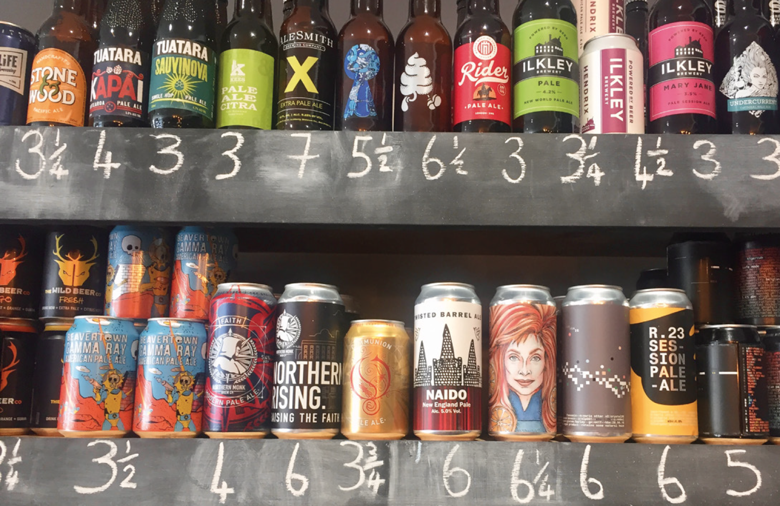
A craft beer branding revolution has been unfolding in front of our eyes, at both product and brand level, and in this article I will attempt to explain the new design codes that have emerged. Why are consumers happy to pay (quite a lot) more for an abstract, psychedelic artwork on a can than a beautifully designed traditional bottle, with richly embossed glass and a label as shiny as a new car?
Well, imagine a world in which Vanilla, Strawberry and Chocolate were the only Ice Cream flavours, and then suddenly Ben & Jerry’s comes along. Oh wait, that actually happened.
And so it was with craft beer branding. It all seems a like a bad dream now, but the emergence of bigger and bigger brewing groups across the 1970’s, 80’s and 90’s did very little for consumer choice. Instead we saw fewer beer types, increasing scale and all the craft outsourced to creative agencies, with our expertise in the manufacturing of brand image.
I’ve been there, playing a minor role in the creation of ‘Carling Premier’, one of dozens of premium lagers that seemed like the future of beer (in the UK at least) when it launched in the early 90’s, to celebrate that brand’s sponsorship of the newly created Premier League.
Meanwhile anything that wasn’t lager was relegated to League Two. With some notable exceptions brewed by smaller regional players and celebrated by ‘Real Ale’ fans, the rich tableau of other beer styles merged into an anonymous mid-brown pool known as ‘Bitter’.
It wasn’t exactly like this in other countries, but it wasn’t all that different either. Then something amazing happened.
Over the past two decades and across the world, craft breweries have sprung up like dandelions on a summer lawn. Started up by a seemingly endless supply of talented young brewers (where did they all learn their craft?), they have re-invigorated the beer world and excited drinkers with countless new (or re-discovered) tastes and styles: Porter, Stout, Saison, Weiss, Blond, Golden, Red, White, Pale and the undisputed poster child of the craft beer movement: IPA.
This beer style has a very long history, and its full name (India Pale Ale) refers to its invention as a strongly alcoholic brew that could survive months-long journeys across the high seas to the outposts of the British Empire, especially India.
But the products labelled ‘IPA’ in British pubs – until around 10 years ago – were the very definition of the term ‘pale imitation’. Low in alcohol and with recipes created by Accountants, these beers must have looked like sitting ducks to the new breed of craft brewers looking for an opportunity to make a statement.
Upping the Ante
In the UK this statement came from a start-up called Brew Dog, and its flagship beer Punk IPA. The statement (and I know because I once read out this extract from the label copy at a conference), went like this: “This is not a lowest common denominator beer. This is an assertive beer. We don’t care if you don’t like it. It is quite doubtful that you have the taste or sophistication to appreciate the depth, character and quality of this premium craft brewed beer. Just go back to drinking your mass-marketed, bland, watered down lager, and close the door behind you.” 10 years earlier innocent had invented talking to consumers like a human, but Brew Dog told us to f**k off. That’s another level.
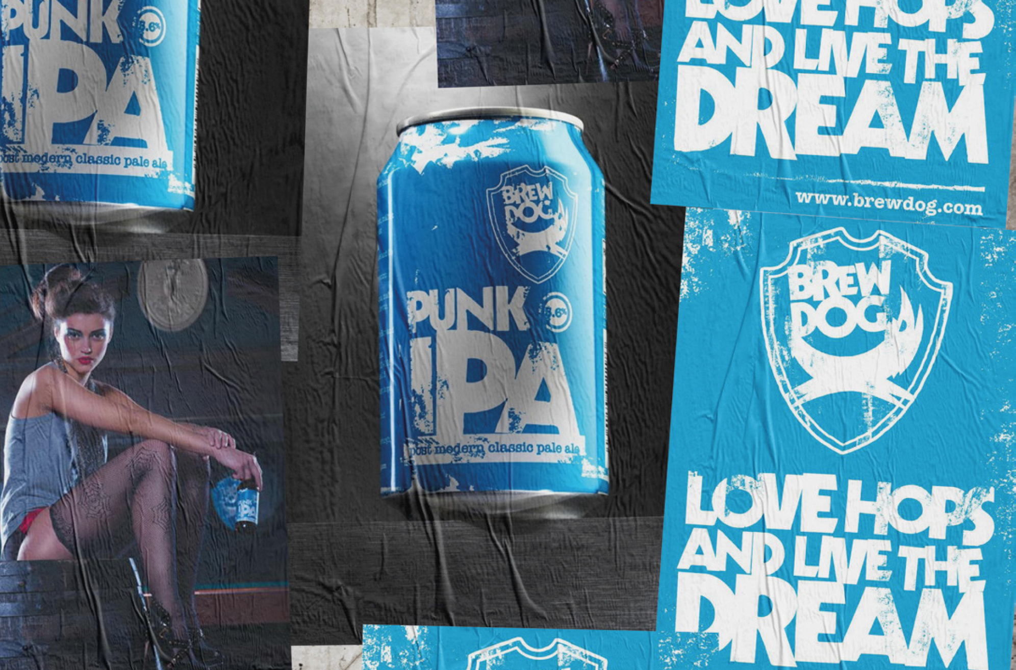
The craft beer branding and label design did the same. In place of the clichés then used by nearly every corporate brand – racetracks, heraldic crests, bland colours and founding dates – Punk IPA’s label was bright blue, and looked more like an unexpected new album from The Sex Pistols than a beer.
Brew Dog’s video newsletters featured bottles of mainstream lager being routinely destroyed by bowling balls, golf clubs or – my personal favourite – Darth Vader’s light sabre.
The beers were named with wit and imagination – alongside Punk IPA we got Dead Pony Club, 5 a.m. Saint, Trashy Blond and Elvis Juice. I’ve got Spotify playlists named after all of them.
These sub-brands had a sense of humour, story and purpose, and this became one of the defining features of craft beer branding language.
The Brewer’s Art
In the USA the craft movement had been up and running for a decade longer, and with mainstream beers more concerned with shelf shout than heritage, much of the early design language of US craft brands was about a return to the past, honouring the richness and variety of European beer styles that early settlers had brought with them.
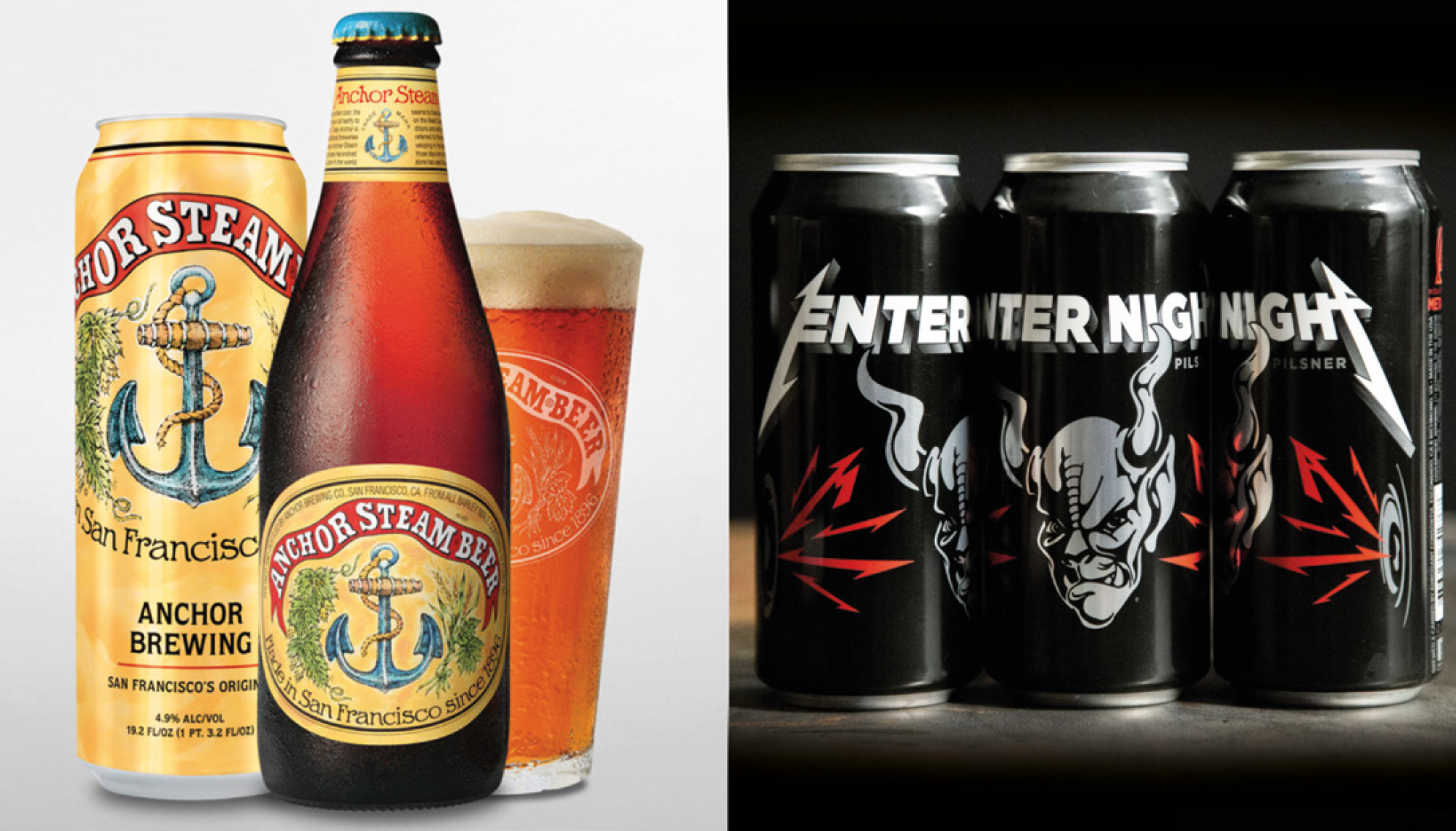
The US also had its fair share of ‘rebellion’ graphic styles, but what both camps shared was the desire to craft the labels and tap handles themselves, as another way to distinguish themselves from the look and feel of ‘big beer’. This proudly selfsufficient, locally sourced and hand-made approach made early craft beer branding easily identifiable. Their vibrant naivety or painstaking artistry contrasted starkly with the slick salesmanship of the mainstream.
This approach is not about the lack of a marketing budget, but a genuine alignment between the values of craft beer pioneers and many artists and designers. As Greg Koch of Stone Brewing Co. put it in his foreword to 2014’s ‘Cool Beer Labels’: “I’d become fascinated by the art, integrity and inventiveness of small brewers. When it came time to create the labels for Stone, the main challenge was finding the right artist to help me create my vision”.
He also railed against the misinformation of ‘faux-craft’ imposters, with “a label that suggests a beer is made somewhere it’s not. Or by a company it’s not. Or on an island it’s not. By a small independent company, when it’s not. By a small brewery that doesn’t actually exist except on a paper label. That’s horseshit!”
The book’s Authors Daniel Bellon and Steven Speeg also provide plenty of insights into the undeniable if almost undefinable appeal of craft beer branding and label design in particular. Answering the inevitable question about what defines the ‘Cool’ of the title, Daniel says: “Well some of the labels and cans have great typography, some have nice illustrations, some are odd and quirky, others may seem plain but have a nice, elegant look… The truth is we didn’t have a set of rules, it was all gut. It was all “Wow, that beer looks cool!”
Steven described his journey to co-authoring the book in a way that resonates strongly with me: “I have always enjoyed well designed labels and have found some amazing music and books because their covers drew me in”. Yes! That’s it! They’re all album covers: gateways to an entire world of stories, characters, adventures and emotions.
Greg Koch said something similar in the foreword: “Beer labels can be pieces of art that are capable of conveying a sense of place, an attitude, or a philosophy. I know beer labels that are nods to comic art, to death metal music and to mythology. And that’s just from one brewery!”
In the same book, Designer Oceania Eagan builds on this underlying theme of sophisticated storytelling, from her time at a manufacturer of America’s first gift to the beer world – tap handles: “People would request a beer based on its tap handle. Tap handles became billboards for what they were pouring, but unlike most advertising, it was the kind that people actively sought out rather than avoided.”
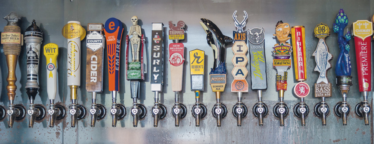
Later in her career, as the owner of a specialist craft beer design agency based in Seattle, Eagan also witnessed a clear trend in the approach to craft beer branding, and especially in the area of communication hierarchy:
“Way back when, you didn’t need to have a sub-brand; you just had your main brand and then whatever style of beer you were selling. But then people started building entire brand personalities on one style of beer, so we started to get really distinct and elaborate sub-brands. The pendulum is swinging back the other way now, toward investing energy in the master brand … having a different personality for every single beer can be too much for consumers to digest.”
Enter the dragon
Whatever branding strategy was in play, craft beer just kept getting more and more popular. The most successful pioneers reached scales where they were starting to become mainstream themselves, and the debate about whether craft beer should be defined by its small scale goes on to this day.
That didn’t happen. No successful new category can survive long without attracting the attention of the big players in the market, especially when it’s been eating their lunch.
With the global trend in beer one of slow decline, craft was one of the few bright spots in an otherwise challenging landscape. So after a brief experiment with trying to innovate existing brands, or make up some much derided faux copies, the major players realised that it would be a lot easier to buy authenticity, than to try to manufacture it.
Given that the entire craft category got to where it was largely by its demonisation of the companies now waving the chequebooks, this didn’t always go smoothly. But as a Bloomberg article from 2015 explained, there were plenty of reasons to expect the mainstreaming of craft to go well for all parties:
‘When AB-InBev made the first of its major craft brewery purchases with Goose Island in 2011, its founder, John Hall, didn’t have a problem. “I was really pretty confident they wouldn’t spend that money if they were going to screw it up,” says Hall. “And I think they also realised that craft was something they didn’t understand.”
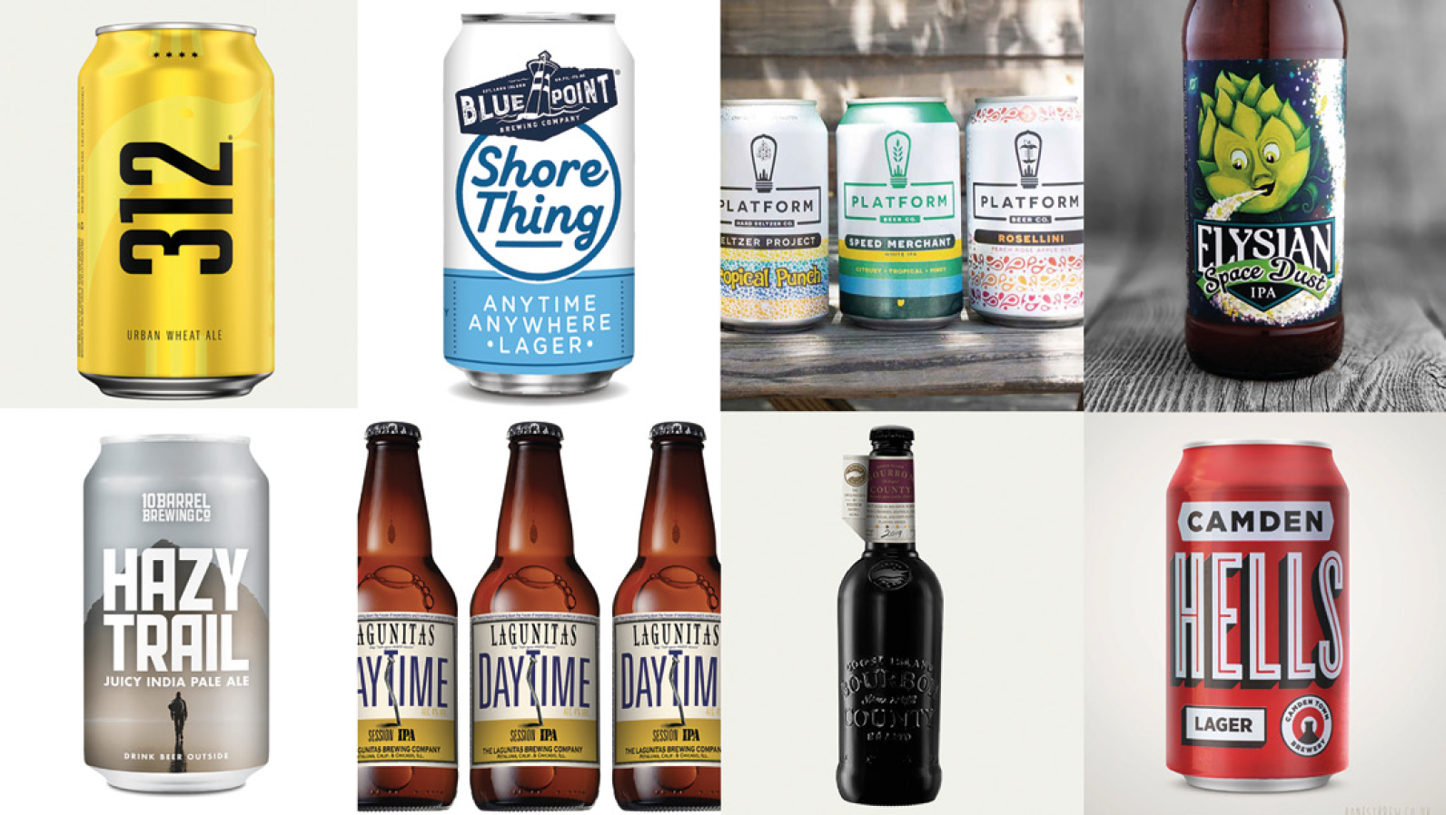
In recent years AB InBev has acquired another dozen craft breweries, including Elysian and Blue Point in the USA, Cervejaria Colorado in Brazil, Columbia’s Bogotá Beer Company, London’s Camden Town Brewery and Bosteels, a seventh-generation Belgian brewery.
Heineken acquired the part of Lagunitas Brewing that it didn’t already own in 2017, declaring that it would expand this brand to become the world’s first global craft beer. It continues to invest in the category, taking minority stakes in both Beavertown and Belize Brewing Company in 2018.
But if this all sounds like beer is going back to business as usual, think again.
A recent report by Accenture ‘Dancing Giants – Reclaiming Growth in Consumer Goods’ sees the big brewers’ acquisition strategies as templates for what all FMCG companies will need to do, to thrive in a changed consumer world:
‘Why? Because authenticity beats familiarity. Consumers are no longer tied to established brands and will reward companies that allow them to experiment. According to Accenture’s research fifty-five percent of consumers are attracted to buy from brands that innovate and constantly launch new products.
Big CPG will have to fight against the muscle memory to make this work. Scale alone is not the superpower anymore – balancing scale and flexibility, and embracing complexity, is.’
About those aliens
As we’ve seen, part of the attraction of craft beer is the direct link between the art of brewing great beer and the creative vision of the passionate entrepreneurs behind it, expressed in branding and packaging design. Severing that link, introducing brand management, rigid design systems and corporate innovation processes could end up strangling the Goose that lays … oops, no pun intended.
That’s surely not a real risk as long as brand owners recognise the value that may lie in the unfamiliar and quirky design assets they’ve acquired, along with the brands and breweries they’ve purchased. The exemplar here could well be Ben & Jerry’s, whose purpose, ethics and brand identity have remained remarkably consistent over the twenty years since the company was bought by Unilever.
As a brand design Consultant, I’m fascinated by the innovative approaches that craft beer branding has thrown up. At first sight the design language looks like anarchy unleashed, but on closer inspection there are plenty of examples of disciplined design systems, and more importantly, recognisable ‘Distinctive Assets’ – the DNA of branding.
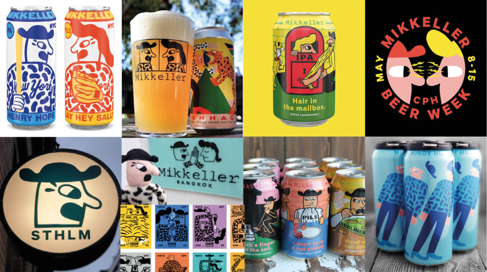
Whilst these are normally found in logos, specific colours, symbols or shapes, why not extend the definition to an Artist’s unique style of illustration? The key to branding is consistency, and to new generations of visually literate consumers (who practically live on image-driven social media), identifying a ‘style’ is what they do all the time.
In the anti-authoritarian world of craft beer branding, the rules are different: passionate entrepreneurs and creative artists become natural partners, reflecting the art of brewing innovative and tasteful beers in a more conceptual way. In a nutshell, and perhaps best understood by those of us who once saved up to buy vinyl records, they’re album art.
So for me Beavertown’s gun-toting aliens, and Mikkeller’s iconic comic book characters and their ilk, can and do create distinctive brands. Even better, through packaging’s secret weapon of ‘sensation transference’, the art and the taste complement and amplify each other.
One more for the road…
But craft beer branding design isn’t all about hairy mailboxes and death cults. There’s an equally valid graphic style that you might call ‘painstaking artistry’, more often seen at the premium (and more alcoholic) end of the scale.
Our client Hertog Jan is a rather well-kept secret. Based in a tiny brewery in the southern Netherlands, its team of Brewers have been crafting regional speciality beers there since well before the term ‘craft beer’ was invented.
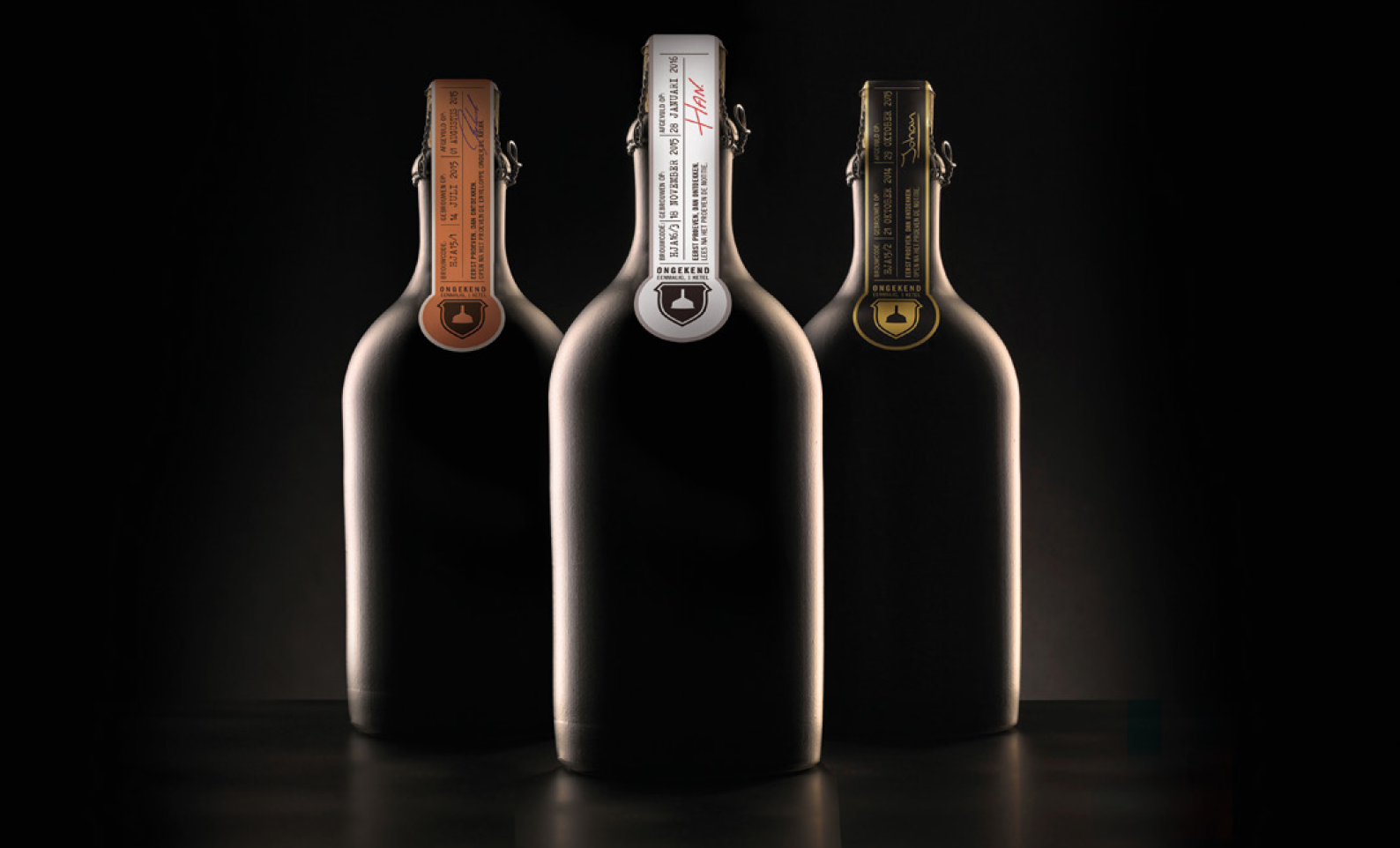
As well as a packaging overhaul five years ago, we’ve worked on a number of new launches to firmly establish the brand as an innovator in the new craft landscape. These include a beer range called Unknown (‘Ongekend’ in Dutch) which was brewed in strictly limited quantities of one kettle, with each beer’s identity only revealed at an online tasting session.
But of all his Speciality beers, Head Brewer Gerard van den Broek is especially proud of Hertog Jan’s Quadrupel. Sub-branded ‘Grand Prestige’, it’s marketed as a beer to be savoured, ideally after a couple of years ageing in the bottle.
Witnessing the success of what was now a sister company – Chicago’s legendary craft brewer Goose Island – Gerard invited himself to the USA, to witness the creation of their flagship ‘Bourbon County’ stout.
This brand had started as an experiment, ageing Goose’s stout in bourbon barrels. But it turned out to be a taste sensation, kick-started a whole new category and grew rapidly. By the time Gerard visited Chicago, the annual release of a new Bourbon County series was a much-anticipated event in the US craft beer calendar.
It made perfect sense for Hertog Jan, with an already well-known flagship strong beer, to create its own annual limited edition, so in Spring 2017 Grand Prestige ‘Vatgerijpt’ (Dutch for barrel-aged) was born. Available in 4 variants based on the barrels used (Cognac, Port, Bourbon and ‘third use’ Bourbon County, borrowed from Goose Island), it was an instant hit with the brand’s fans.
We created the branding and packaging for the launch in 2017, crafting a mark which balances three names and as many symbols without skipping a beat. That leaves freedom for the rest of the design to convey each year’s unique taste adventure.
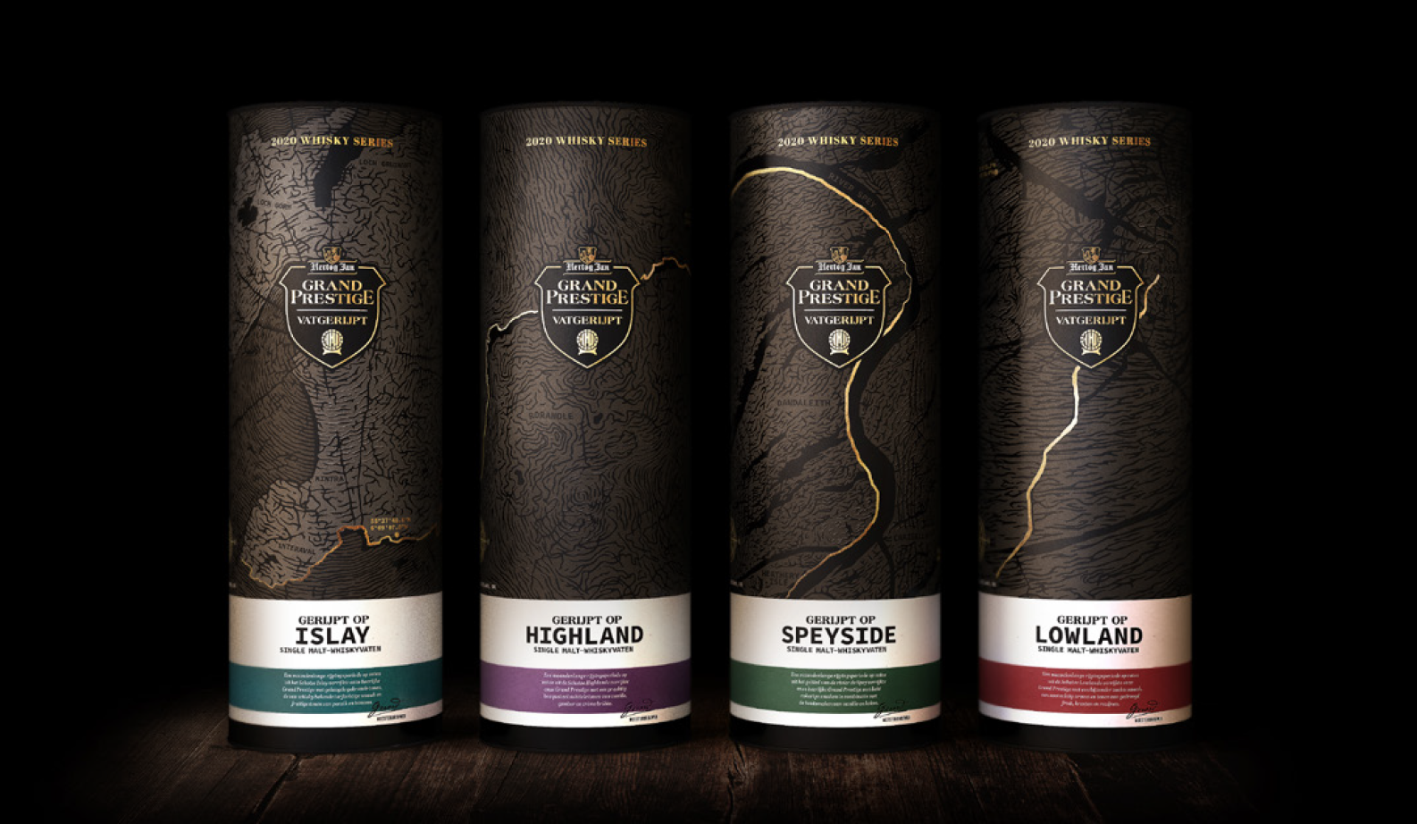
For the 2020 series the barrels have been sourced from Single Malt Scotch Whisky distilleries, having already matured four very different whisky styles from the Highlands, Lowlands, Speyside and Islay.
The advertising theme for this edition, created by Hertog Jan’s advertising partner The Valley, is all about Patience. Little did they know how prescient this would turn out to be when the March launch had to be postponed, due to the pandemic.
Having seen 2019’s 35,000 bottle production sell out in 26 days, we wondered what effect this year’s six-month delay would have on demand. The answer? Er, 30 minutes. Good job our client saved 4 bottles for us.
This article was first published (before the delayed release of the 2020 series) in the April edition of Brewer and Distiller International.
To learn more about craft beer branding and how we may help you, please get in touch. Or check out our previous work here.


