Welcome to this special edition of Shelf Life, the blog that comments on the new brands, new packaging designs and innovations popping up daily in supermarkets, worldwide.
Nowadays the blog lives on my Linked-In profile, but I thought it might be useful to collate the top 10 ‘liked’ posts from the past 3 months. Enjoy!
We’re all niche buyers now
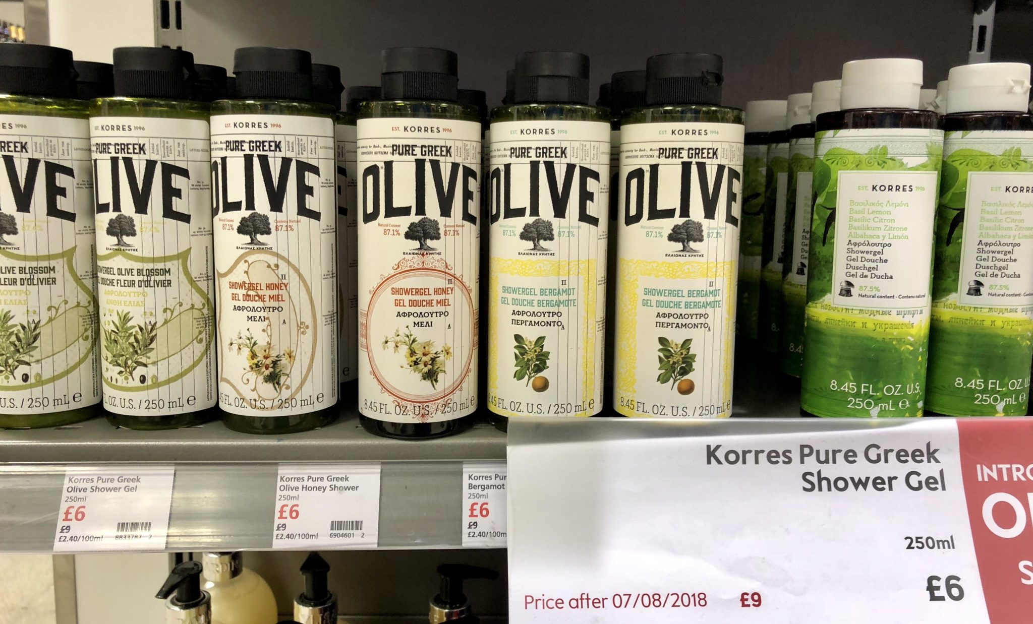
The future of brands is going to be very different. Here’s a nice analysis by Zander Nethercutt on Medium: ‘In this new world, FMCG companies and advertising agencies are experiencing utter paralysis. Advertising is not “dying,” per se, but what is dying are the brands that succeeded in a world without the unparalleled access that Facebook and Google afford consumers and producers to each other.’ In the short term retailers are broadening their ranges to keep niche buyers interested. The number of such buyers is increasing thanks to the unparalleled access to niche products mentioned above, and so we see brands like Korres (and dozens like it) appearing in our local supermarkets. Despite first appearances, it’s shower gel; but it kept me interested.
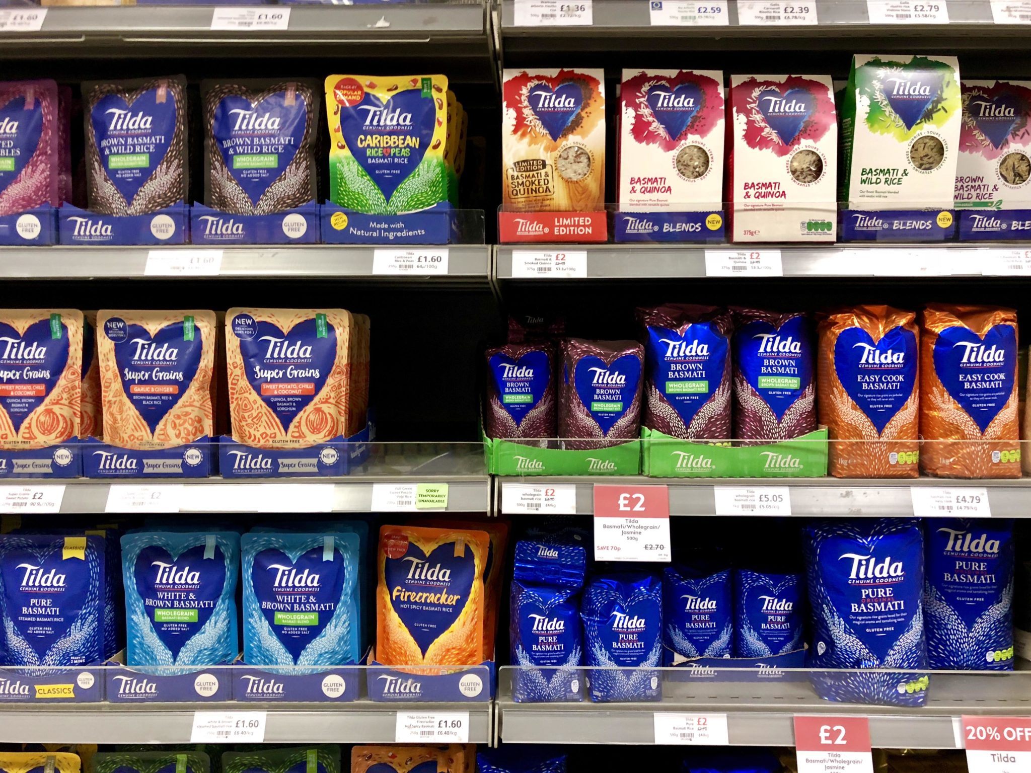
Nicer Rice
I realise I’ve only recently praised this brand design at a detail level, but now I’ve also got to applaud the range system too. Effortless choosing for shoppers across 5 product types, yet still providing more than enough brand blocking. That wasn’t effortless to achieve – nice work!
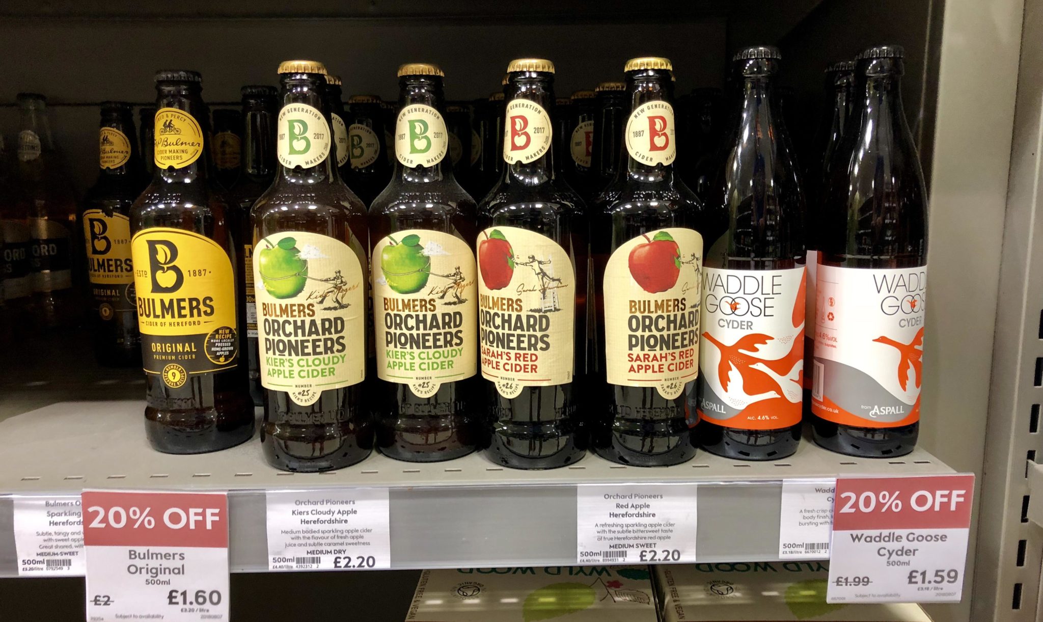
Corporate Craftiness
Corporate thinking and the craft/challenger mentality are rarely compatible, and the signs are usually obvious in the copy/paste approach to branding and communication. Product obsessed startups do not dream up sub-brand ‘concepts’ like ‘Orchard Pioneers’. Sarah and Kier are no doubt real people (maybe even real product developers) but I don’t believe a word of the ‘recipe no. 26’ twaddle. As for the autographed, watercolour ‘homages’ to their artistry, yeah, just what craft makers do, tell you all about themselves. Not. Does the consumer notice or care? Maybe not, but there are plenty of more authentic stories on the shelf. ‘Waddle Goose’ does not look like one of them…
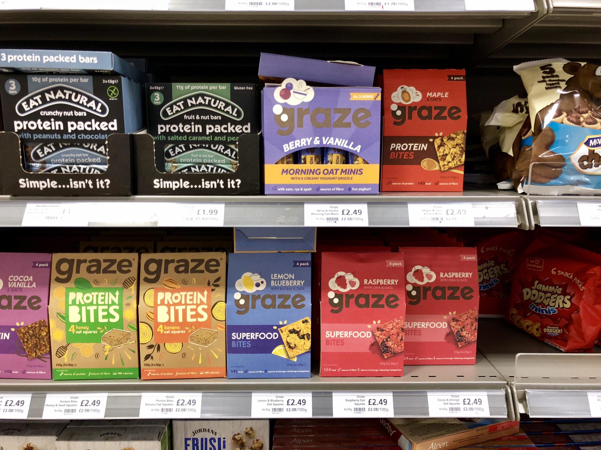
Serious Error?
This new design for graze suggests that they want to be taken more seriously, dropping the innocent brown boxes for something that looks like it, er, maybe does something? Or is it thinking about doing something? And where’s the logo gone?
Personally I think it should have continued to look like the graze we all learned to love from its subscription boxes (brown, by the way), with healthy-ish foods in cute packs with ‘hand-drawn’ messages on them. Not so serious, but distinctive and memorable: healthy ingredients for brand building.
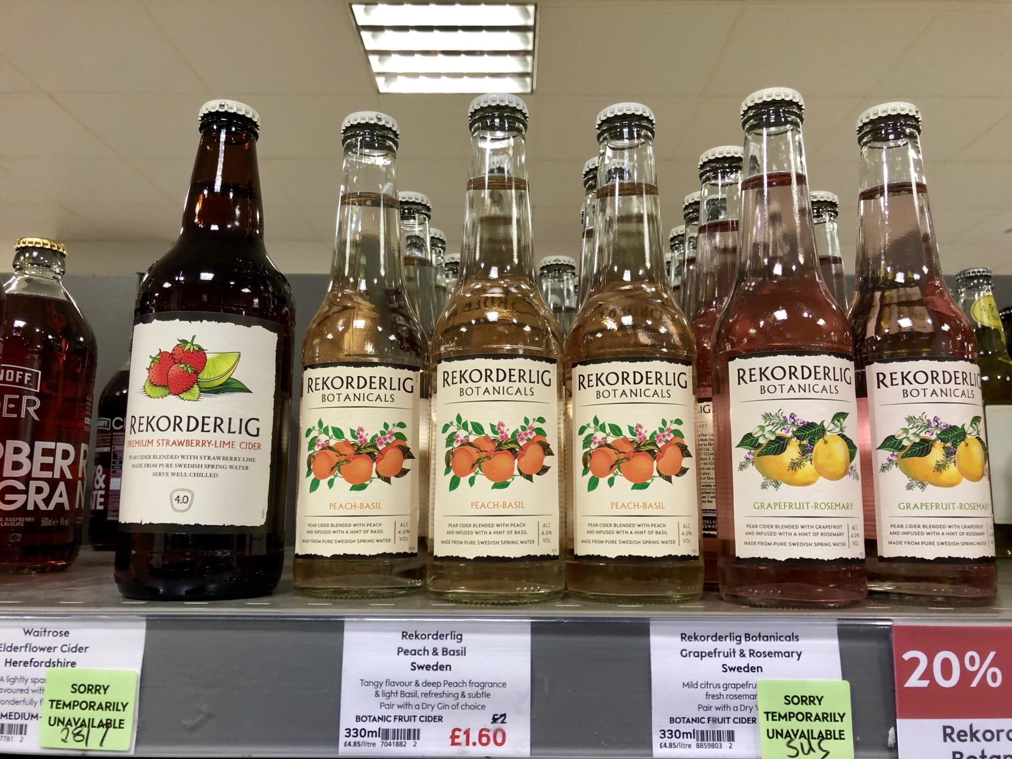
Showing off your botanicals
Buzzwords sell. Unlike ‘protein’ which doesn’t have a clear set of visual associations, ‘botanicals’ certainly does. Nicely exploited by Rekordelig here, we get a softer and surprisingly natural cartoon of fruit, with the all important herbal and floral references. A simple transparent bottle with no neck label and a delicate hint of colour completes the rather lovely picture (of me drinking it on a picnic blanket watching the setting sun at a pop festival… sorry I was miles away there!)
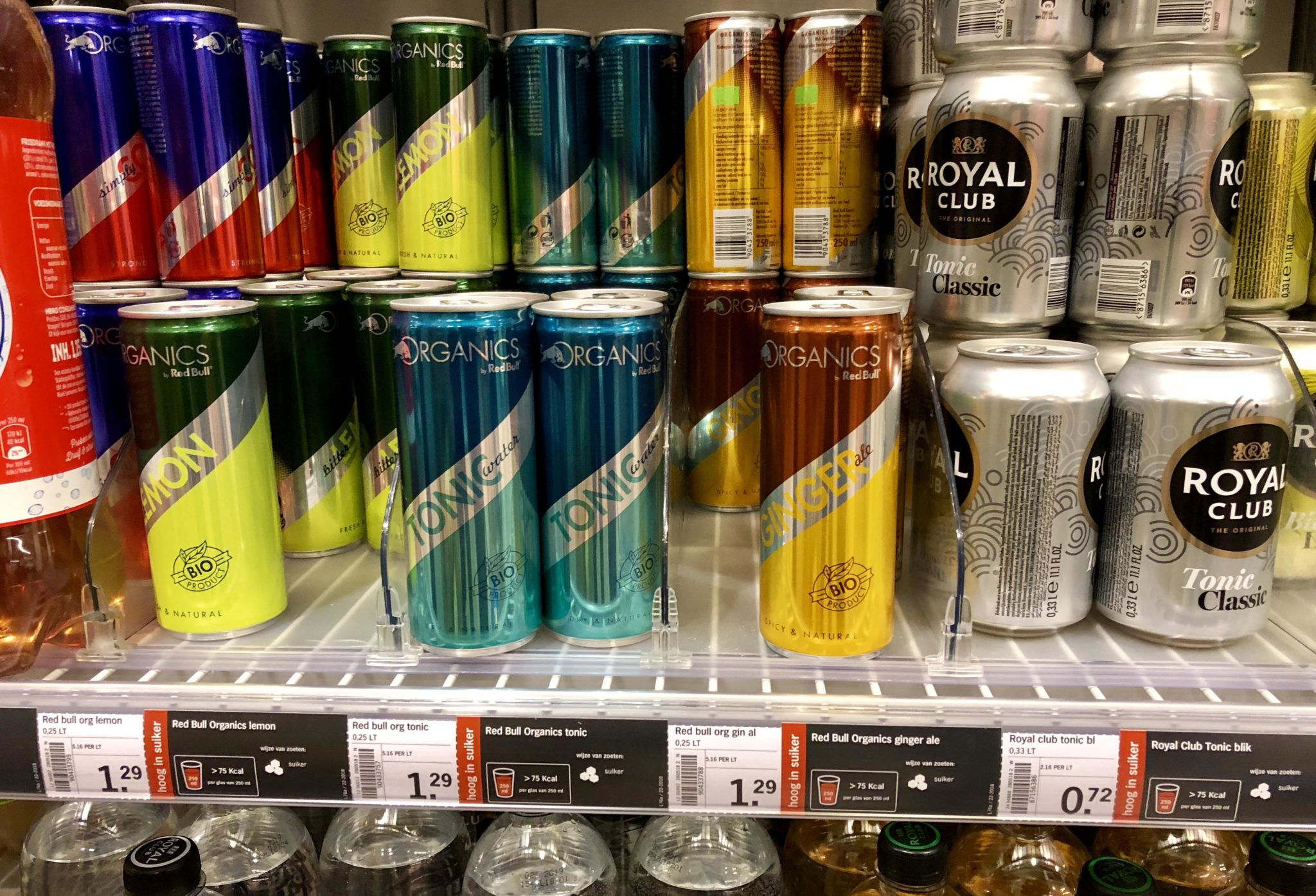
Hard, soft or mixed?
Soft drinks are so called to distinguish themselves from hard drinks, meaning alcoholic. This is such a hard-wired split that it’s quite difficult to define the new category set to develop rapidly over the next 5 years. Adult soft drinks and zero alcohol beer (and now zero alcohol distilled ‘spirits’) are defined by what they are not. Mixers such as those pictured here are defined by what they mix with, almost lacking identity in their own right. Organics by Red Bull (shown below) might succeed as Fever Tree for all-nighters, but I expect a whole new shelf of craft sodas to be the next big thing in responsible refreshment.
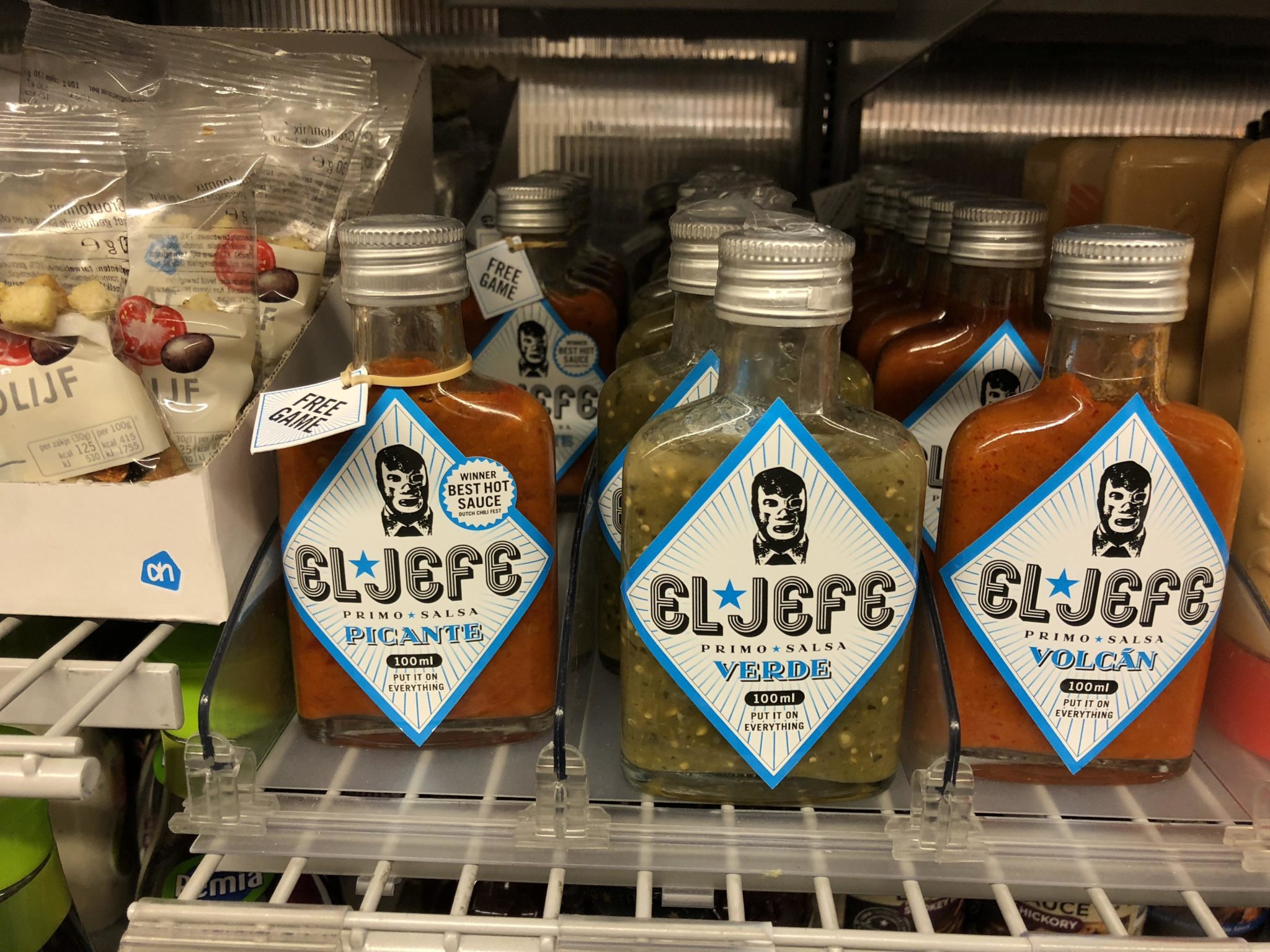
Wresting with authenticity
Despite its carefully crafted appearance of an imported, undesigned brand this is from a local entrepreneur. I wonder if he’s called Jeff. But anyway, El Jefe as he likes to be known is presented in a blobbily printed wrestling mask on a label that is too big for its bottle. Best part is the serving suggestion: ‘Put it on everything’. Genius!
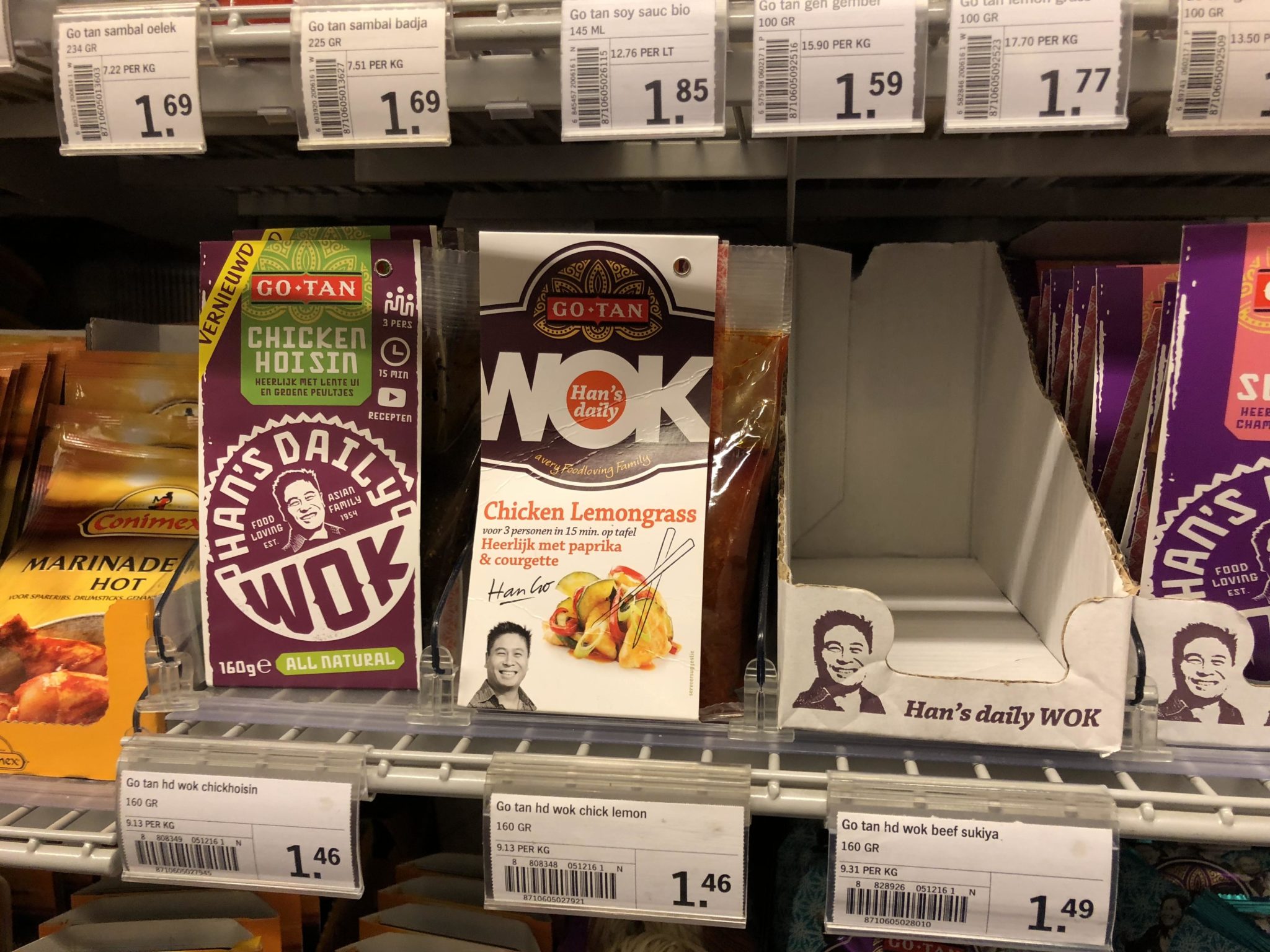
Wok the Talk
Go Tan has always featured the Go family in advertising, and more recently they’ve been playing a key role on packaging too. This redesign of a sub-range shows one of the key trends of the craft tsunami – swopping photography for illustration. In place of photoshopped fantasies of the serving suggestion, we have a mega stamp device that certainly boosts the shelf impact. The Go-Tan branding gets pushed off the top of the pack and loses its charming fan shape, but I think the big bet here is on getting closer to the default craft story in this category: Street Food.
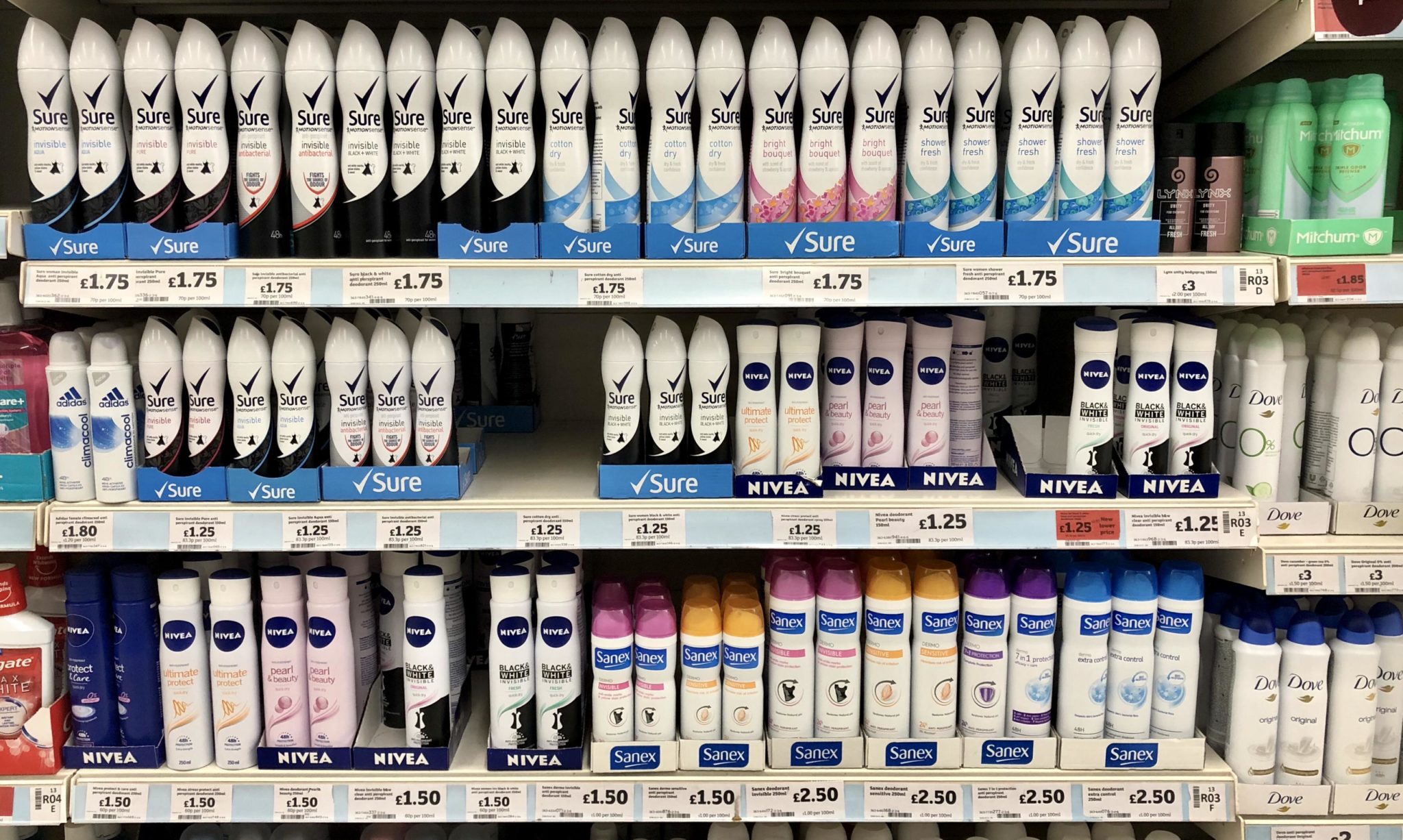
Ticking all the boxes
So here it is, the only brand I can think of (but I welcome your own examples) that has always understood the power of distinctive assets. Sure sports a tick device on its packaging and in its advertising, and has done so (I believe) since the 70’s. Nothing difficult about that, but it’s taken the disruptive force of Byron Sharp to make this the new normal for all brands. Next topic: careful how you define distinctive, brand recall is good, but brand promise is a lot better. Sure manages both.
Mitchum meanwhile has spotted that everyone else is doing white….
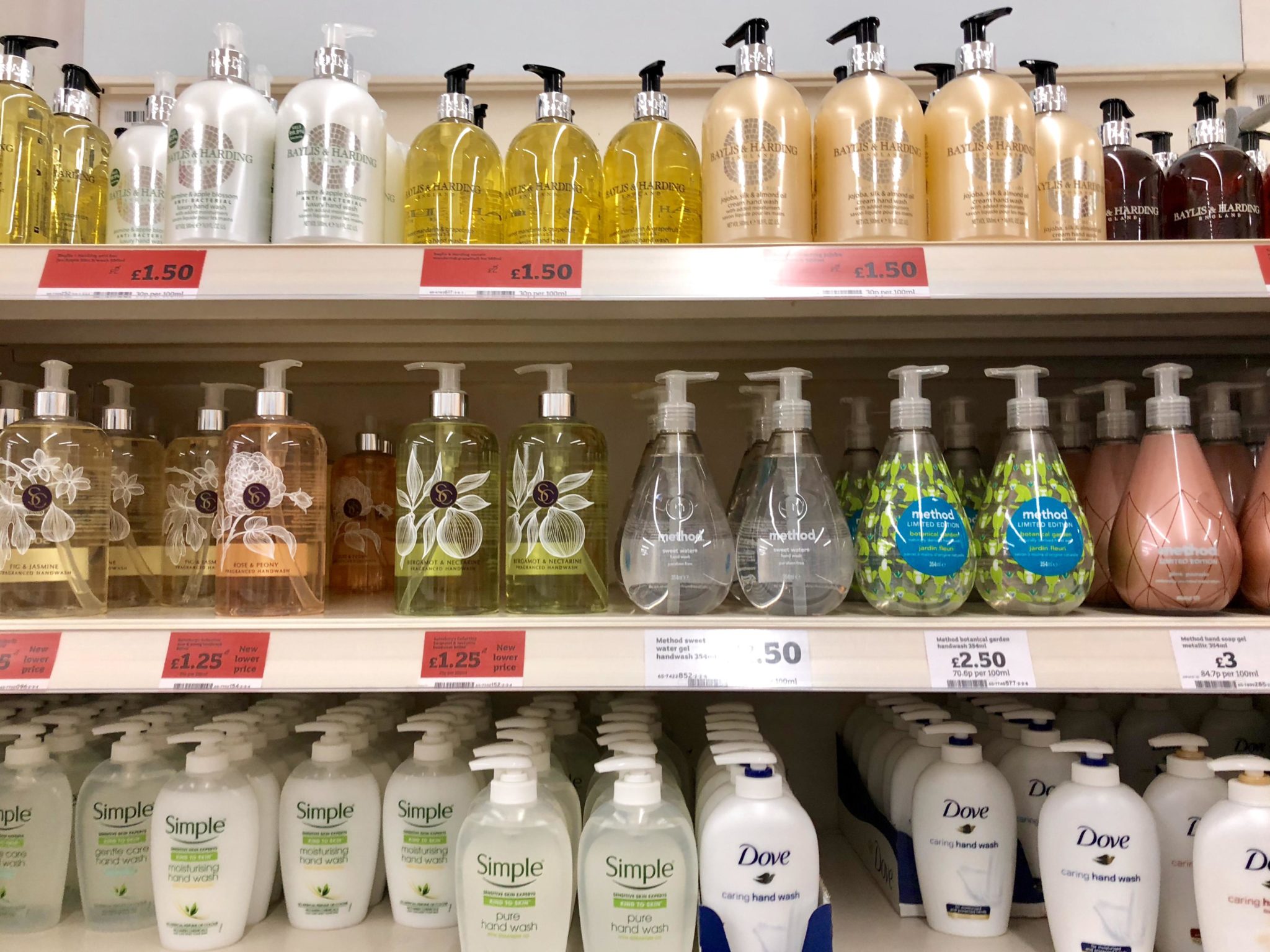
Pump up the volume
How did we ever manage before liquid soap dispensers, now sitting in every kitchen and bathroom of the land? Aesthetic appeal and decor-matching combine with sensory cues of fragrance and skin nourishment, all achieved through bottle form, liquid appearance and transparent labelling. Disappointed by the modern but unemotional method designs that do nothing to enhance its elegant droplet shape, so my £1.25 goes to the SC brand, using botanical illustrations in a highly impactful and on-trend way. This turns out to stand for Sainsbury’s Collection, a watch-out for some of the brands sharing this shelf, perhaps?
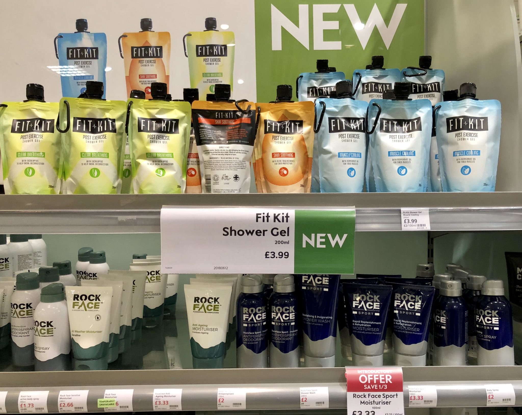
Shower disruption
Well it says ‘NEW’ all over the fixture, but the real evidence is provided by the highly disruptive pouch format (complete with a handy carabiner hook for attaching it to, er, well, to something in the shower). The language (both verbal and visual) is light, natural and therapeutic, and to me quite unisex (though it was clearly merchandised with more overtly masculine offers). Handily they point out that it’s for ‘post-exercise’, ruling out pre- and during. Be careful not to confuse it with your post-workout protein yoghurt, but on balance I was intrigued enough to try it out.
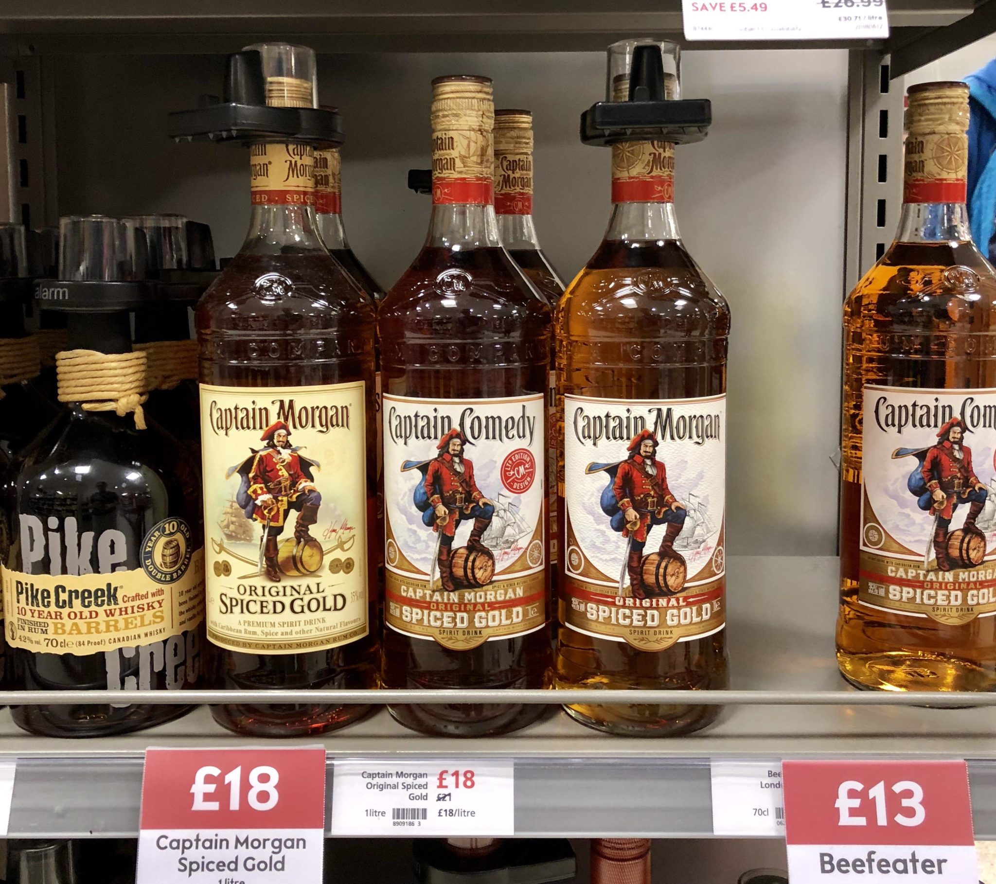
Captain Distinctive?
Still trying to make up my mind on this redesign. It’s more crafted and as a result more premium, but also more fancy and frilly and taking itself just a tad too seriously. Even when the promo pack brands itself ‘Captain Comedy’, I’m not laughing. Missing the crossed swords too.