Welcome to this special edition of Shelf Life, the blog that comments on the new brands, new packaging designs and innovations popping up daily in supermarkets, worldwide.
Nowadays the blog lives on my Linked-In profile, but I thought it might be useful to collate the top 10 ‘liked’ posts from the past 3 months. Enjoy!
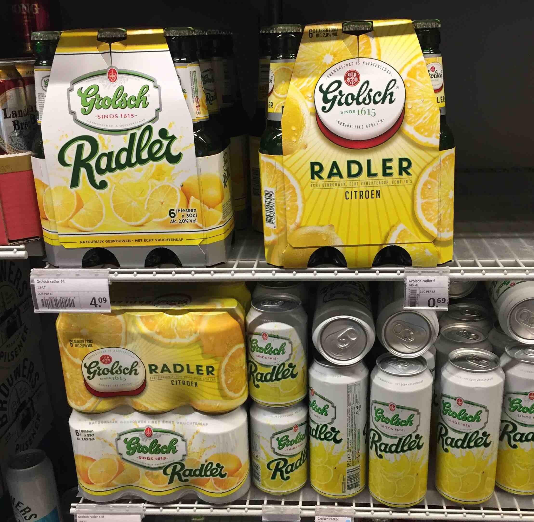
Opening time
Aside from its new ‘bottle top’ logo, Grolsch takes a more serious tone with its new Radler design. It looks ever so slightly closer to actual beer, but watch out for something more disruptive coming to this shelf very soon…
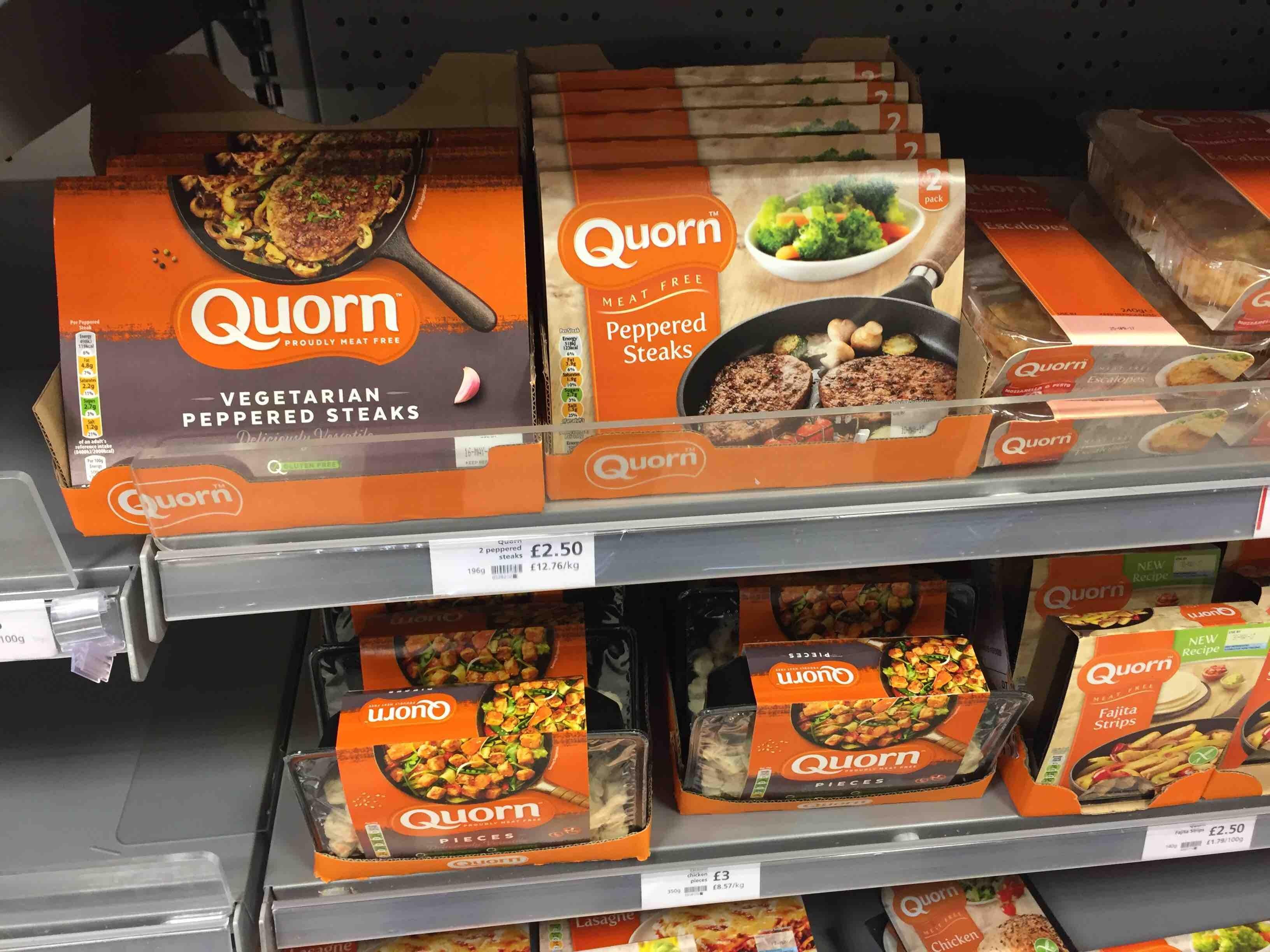
Cooking on gas
Quorn’s new design ‘beefs up’ the taste appeal and the vegetarian creds. The logo now integrates a brand manifesto instead of a wimpy claim floating unconvincingly. Smart choice of cookware too, subliminal link to foodism…
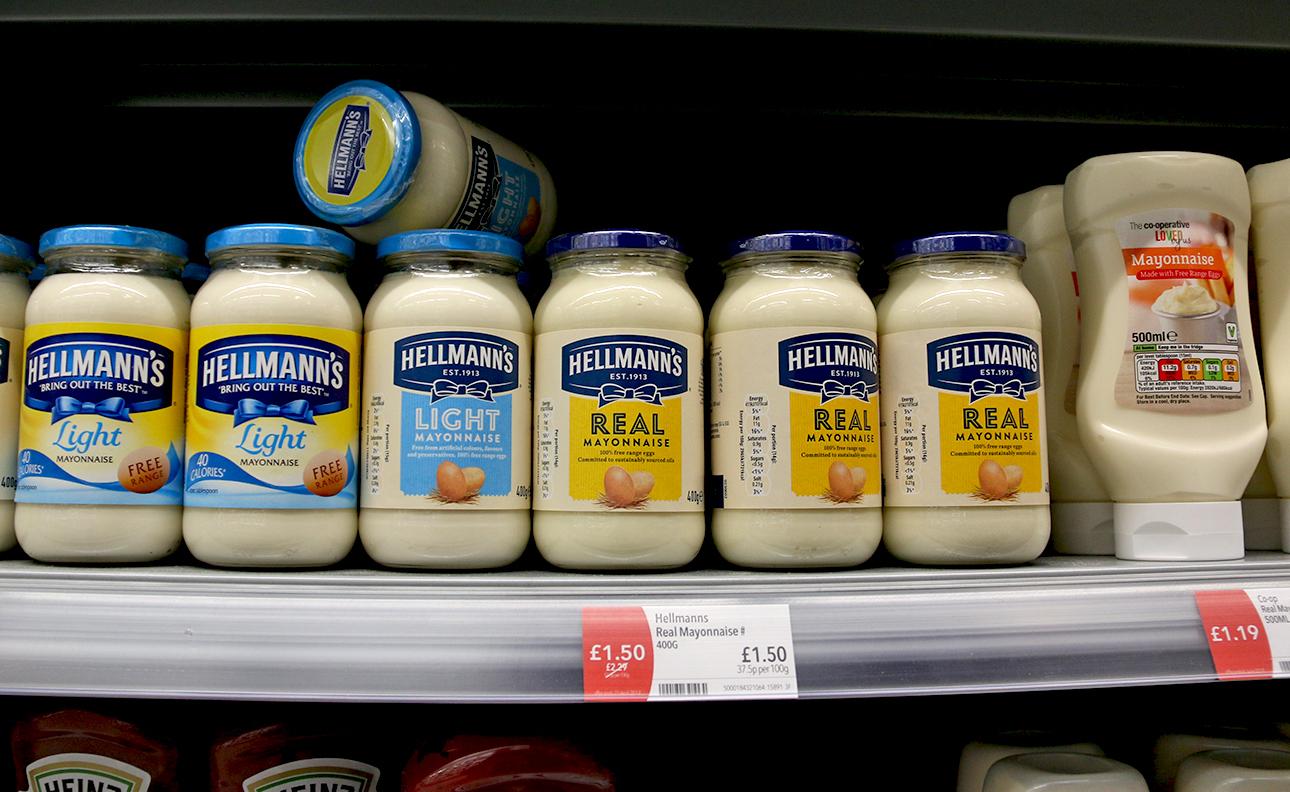
Crafty masterclass
So this is how a major brand adopts the new craft codes taking over the universe without looking like Grandpa at the Disco. Flat colours (yeah, we knew that), drop the pointless dynamism (that too), increase product storytelling (note: that’s not a ‘jingle’ or a claim), and (here’s the tricky one) sweat your distinctive assets (in this case the brand colours, the bow tie logo, the word REAL and even the jar, now that the label design shows off its elegant shape.
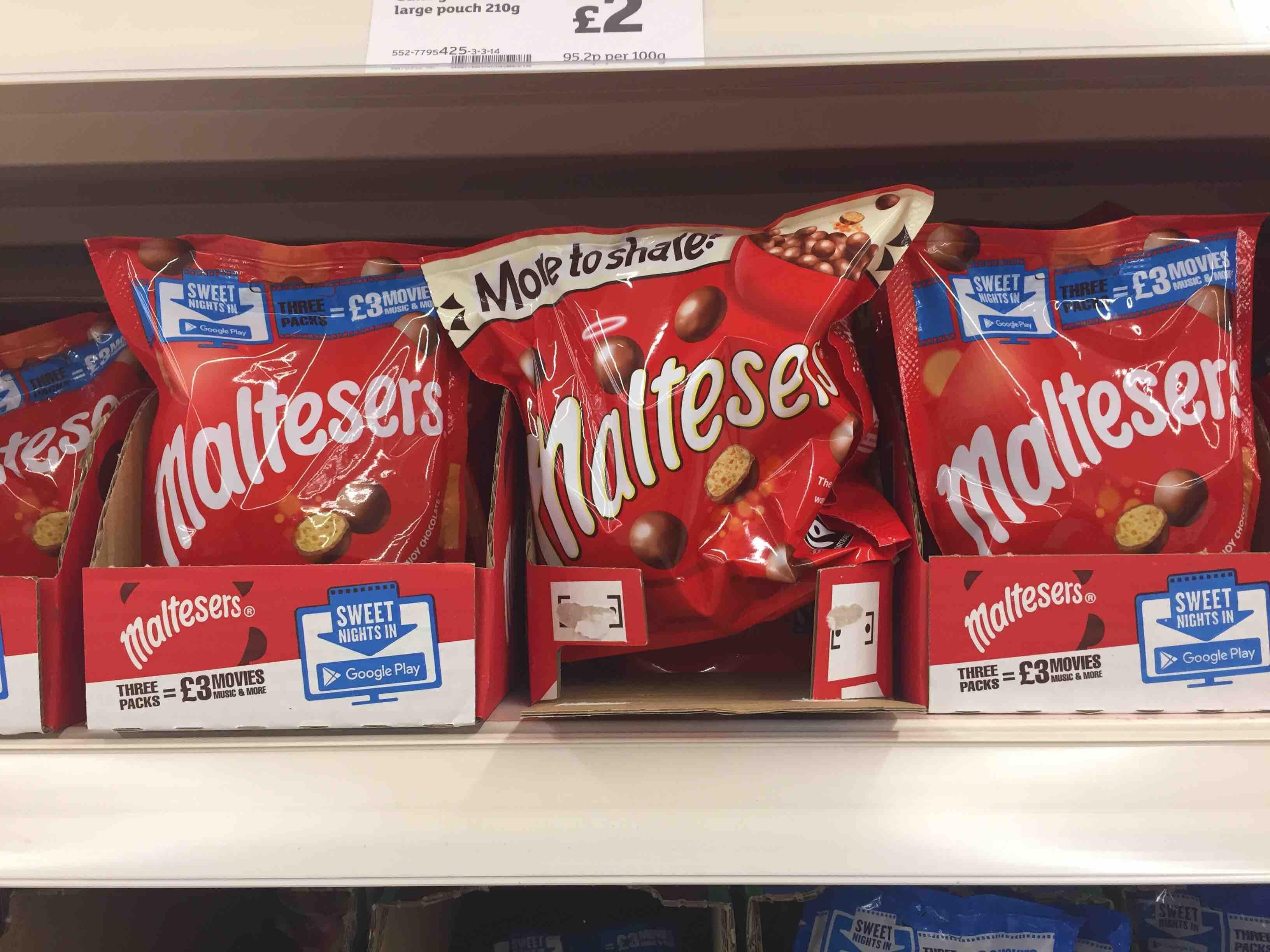
Flavour-less
I’m struggling to see what’s been gained by yet another simplification exercise. For a start Maltesers is not remotely ‘craft’, it’s a frivolous fabrication of the modern age – what I call a Countline, to quote Miranda’s Mum. As such, its logo plays a big role in setting up taste expectations. Malty, not milky.
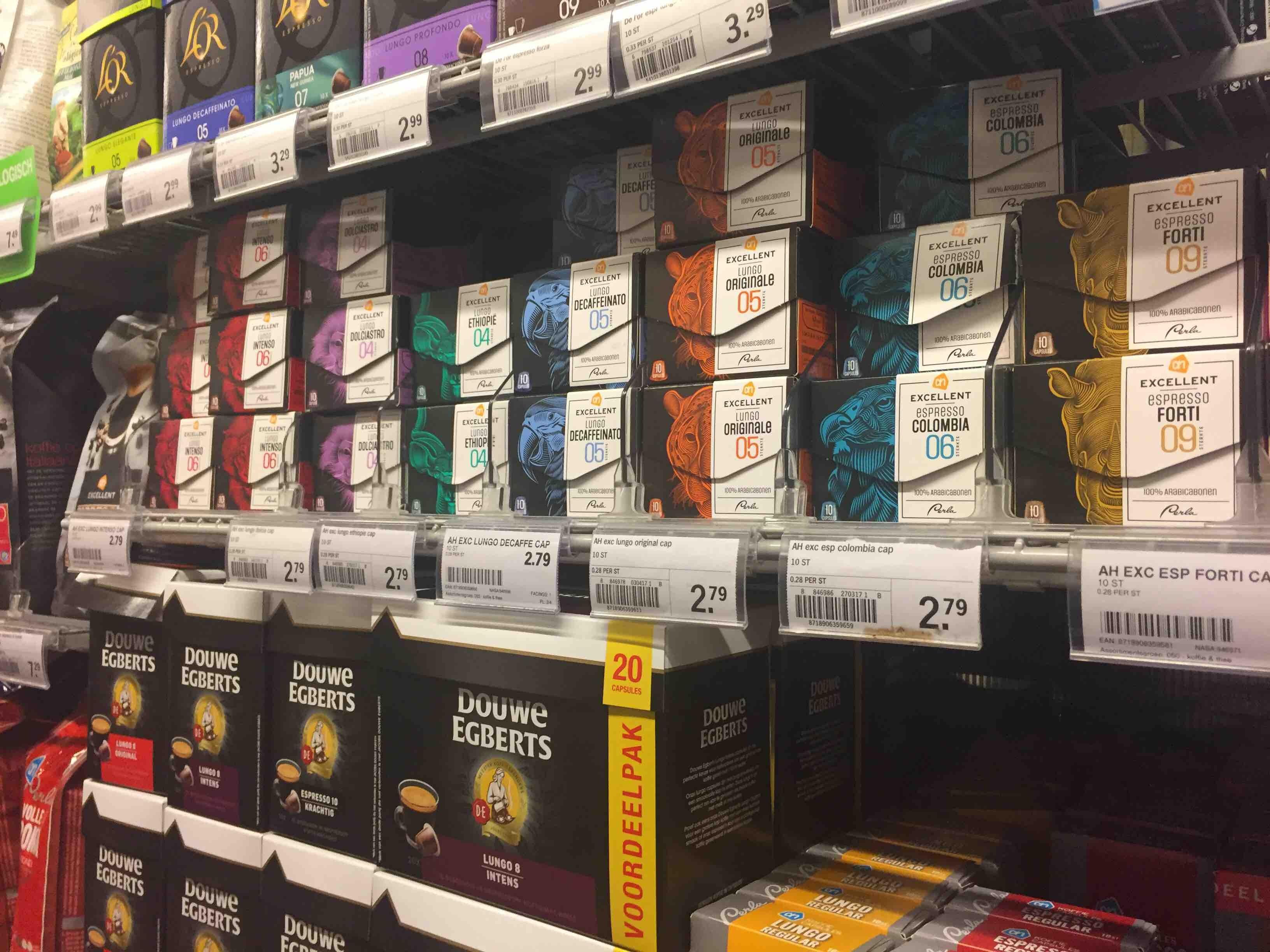
Wildlife attraction
Super chic premium coffee capsules from Albert Heijn. The small box and overt envelope opening makes them even more desirable and tempting. Oooh! Tiger or Parrot? Better take both….
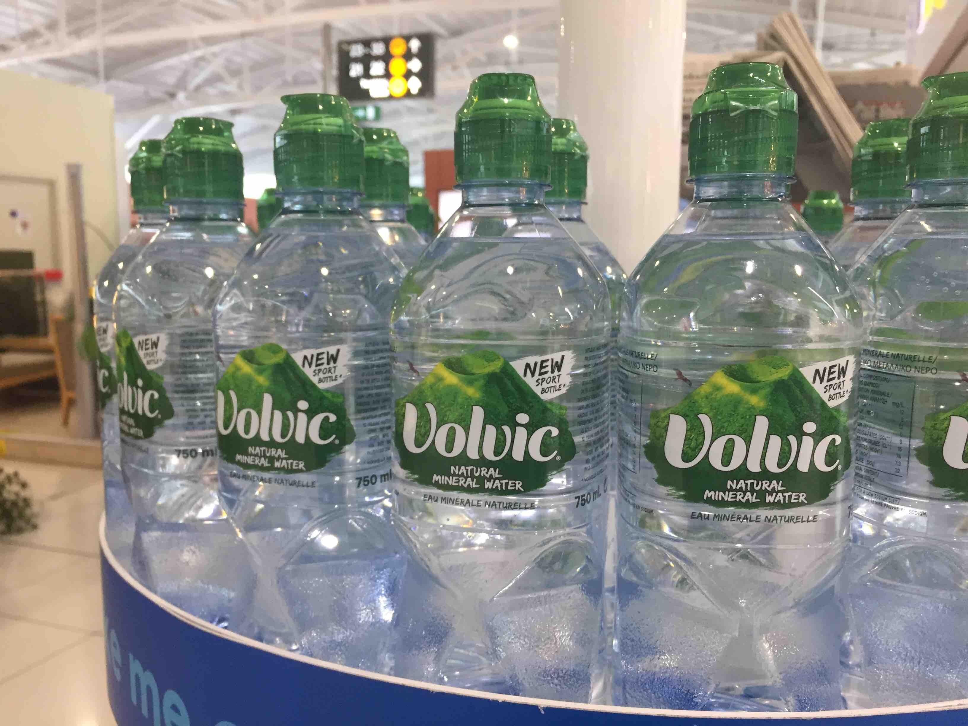
Jurassic pack
This new bottle really puts Volvic up there with its big sister Evian. Its translucent emerald drink through cap and deeply sculpted handgrips give it a ‘chunky elegance’ and off-road capability. Hard to believe it’s just water really.
Craft overdose
So, another famous brand gets the craft treatment, but there seems to be an over-abundance of brand heritage ‘furniture’ stuffed into the space, some at worryingly jaunty angles. Label size has increased to accommodate it, but some peeling edges suggests the labelling machine isn’t entirely happy.
Not the real deal
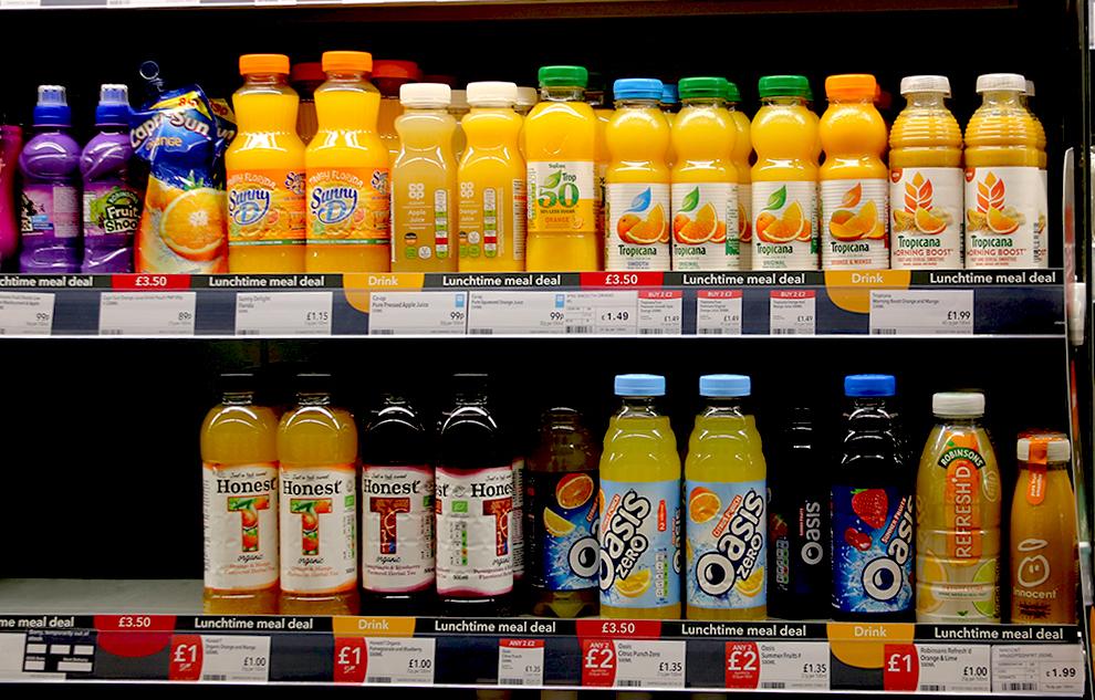
The meal deal line-up at the Co-Op. Tropicana looking convincingly healthy and premium if you’re up for a juice; Private Label seems to be going with the rational approach with just the nutritional buttons to tempt me. In the ‘ready-diluted squash for a quid’ category Oasis looks suitably refreshing and bold, but what’s this… Robinson’s Refresh’d. Must be a partner for ‘Squash’d’, the super-concentrate for the handbag, but looking like that I predict Delist’d…
Front of mind
These merchandising trays at Asda imitate the bottom half of the pack and are so much more effective than trays at keeping the brand (well in this case the product) front of shelf. I’m sure even more impact/messaging could be achieved using this system so why isn’t everyone using it? Maybe it’s a trial, in which case it seems to be working for Molson Coor’s Brewing Co.
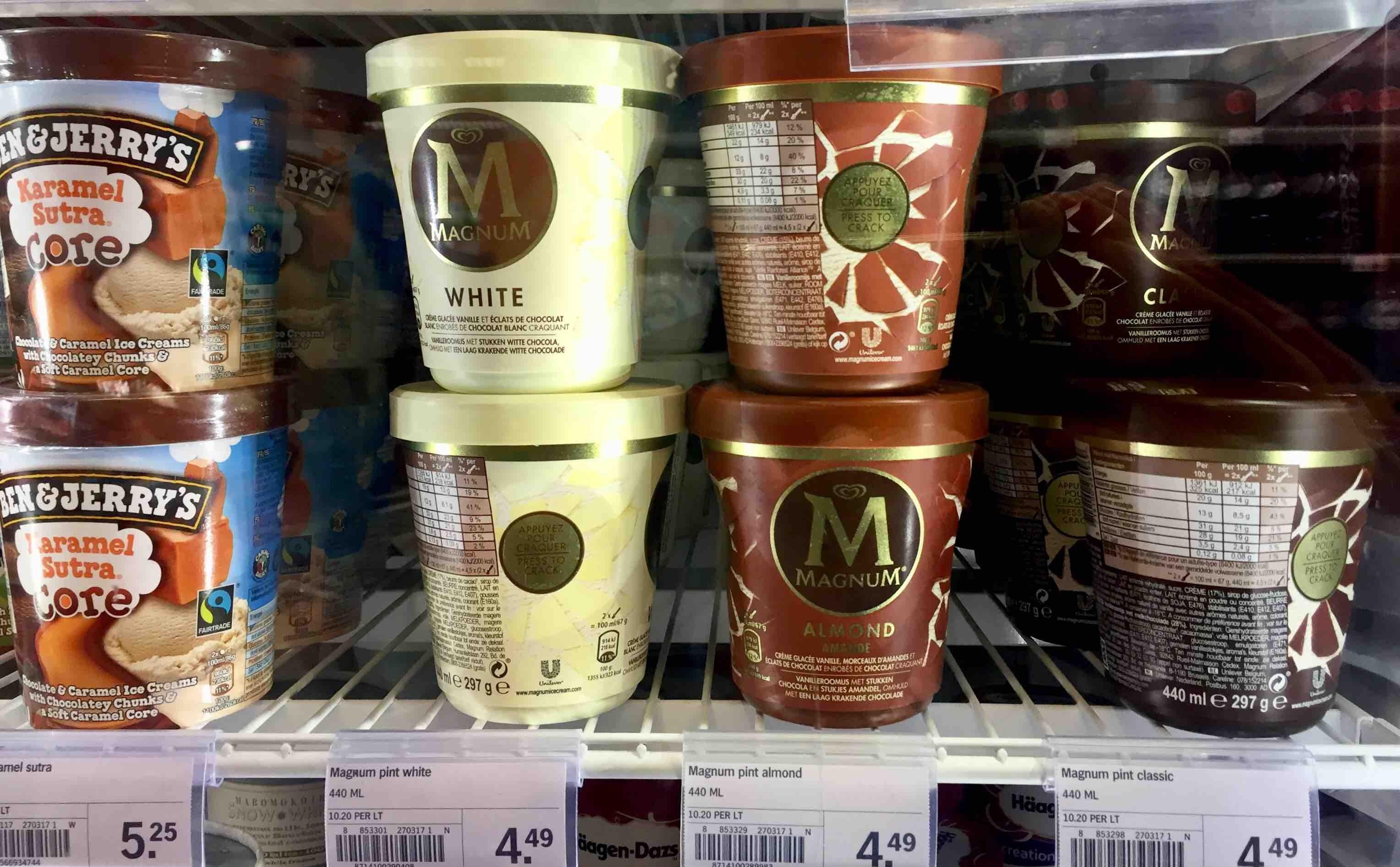
Cracking packaging
Nice touch (literally) on the Magnum ice cream pack. I’m not a regular buyer so forgive me if it’s been there for ages, but I really enjoyed this ‘crack here’ suggestion. Brand experience is the new black, doncha know?