


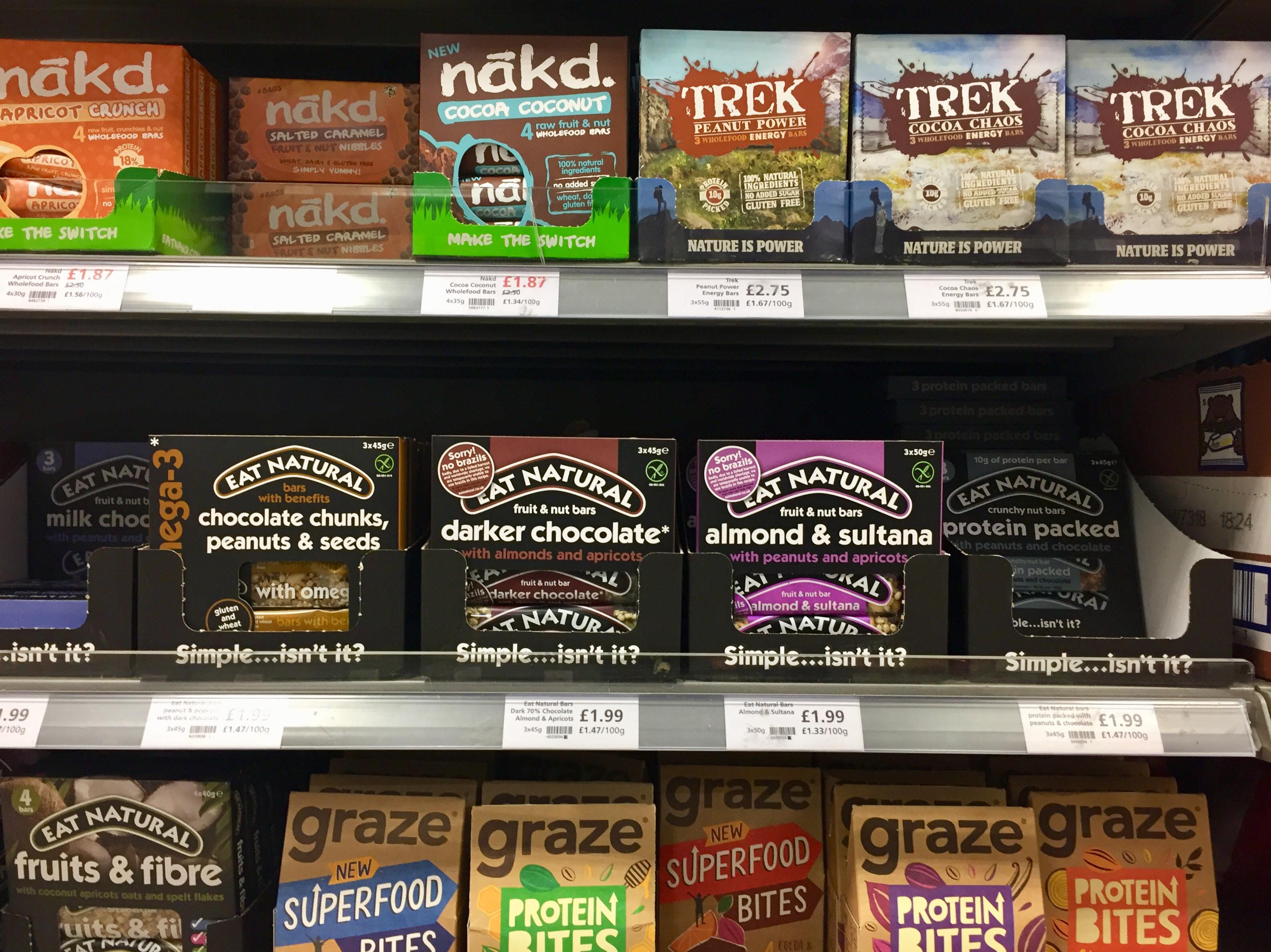
Graze Naked, Trek and Eat Natural
30 years in this game has taught me some principles of good branding that I try to share in these posts. ‘How Brands Grow’ crystallised some of these by giving a name to a hugely important engine of growth: your Distinctive Assets. This array of newly famous healthy snack bars shows how important the name is.
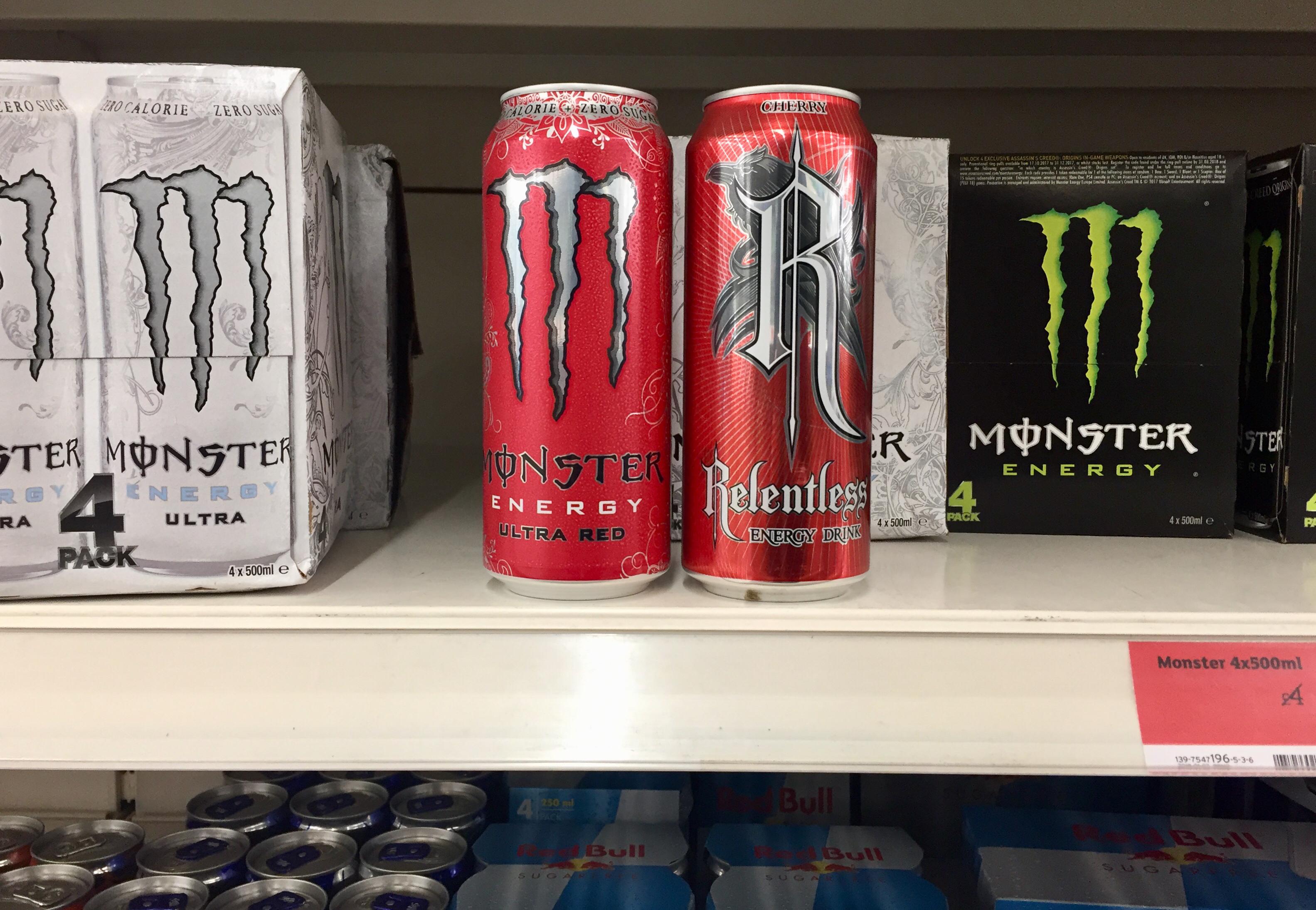
Goth Wars
In the world of Distinctive Assets, Monster is one of my heroes. Who else has managed to get so much of the energy drink action from Red Bull? But the real power is the world of stories the name and branding provides access to: in a word, Goth. In more words: ‘In the world of Goth, nature itself lurks as a malign protagonist, causing flesh to rot, rivers to flood, monuments to crumble and women to turn into slatterns, their hair streaming and lipstick askew’. Who doesn’t want a can of that!? Relentless certainly does, but copying isn’t the way to go.
Three Mustardiers
It’s evident that Maille’s name, jar and crown-shaped label are distinctive assets. They are more, however, because the associations each carries permit me to make up a story. let’s call it: ‘French mustard Aristocracy’. The Bay Tree is a small local brand without the budget for its own jar so it uses a stock item. Not a problem for craft beer, was it? Standard label too, so the pressure falls to the graphics to make it distinctive and memorable. The flying (bay) leaves are a big improvement on visibility, but miss a sense of story. Not sure that ‘windy day’ cuts the mustard, so to speak.

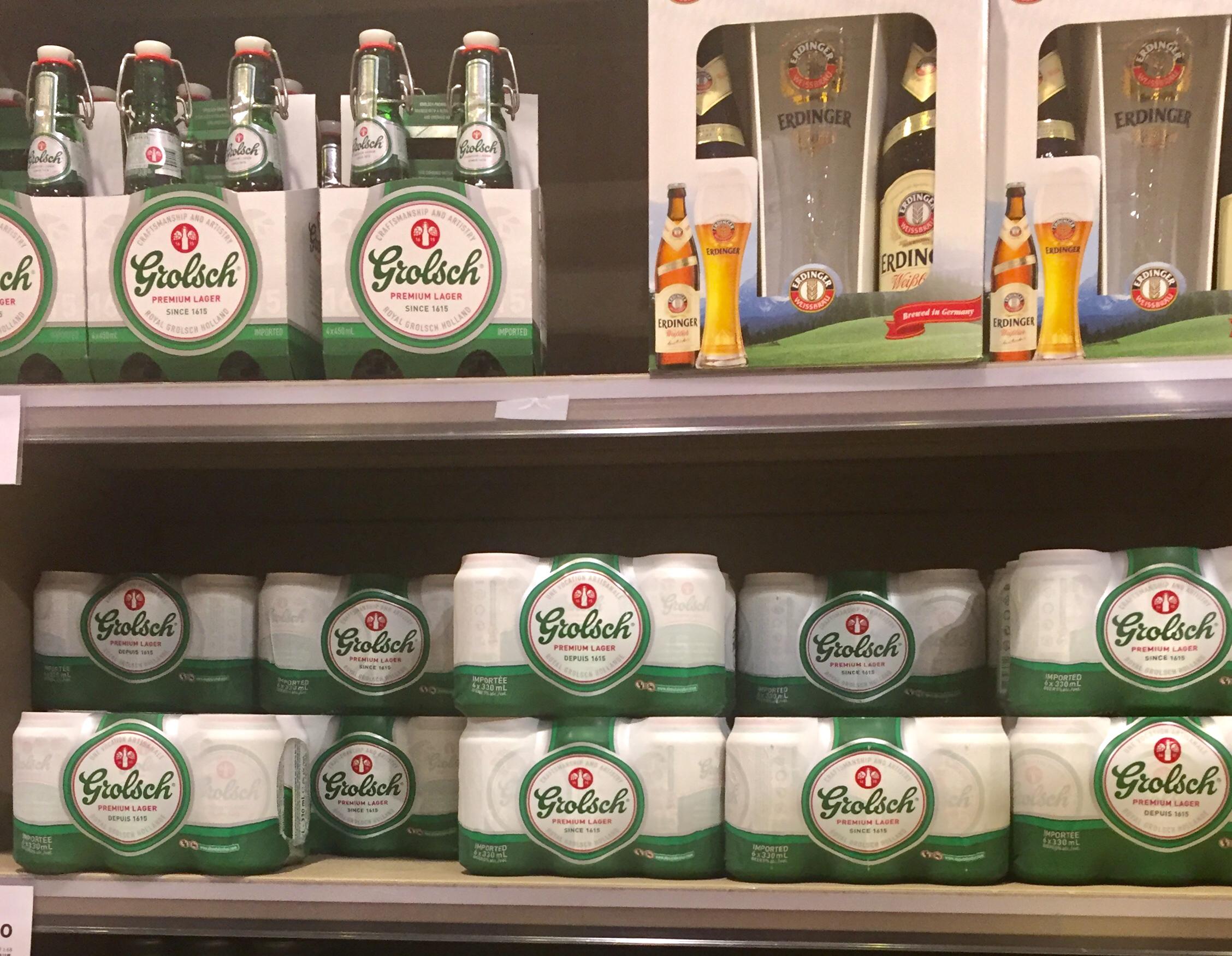
Stopper Power
Distinctive assets don’t come much better than the ceramic, metal fastened stopper (locally known as a ‘beugel’) of Grolsch. But like the Coca Cola bottle, it’s a traditional flagship pack form that will never be the main seller. A strong graphic brand identity helps translate the benefits across formats, and Grolsch’s can shrink-wrap goes further. Silky-smooth, matt printed and really well aligned, it’s a more than acceptable take-away version. No frills simplicity of the graphics nods to craft, so all in all you could say it’s got the total package.
Cat Soup
There are a number of things we can learn from this picture. Most surprising of all perhaps is that cats eat soup. Who knew? From a distinctive assets point of view, that James Bond villain fluffy white cat is gold dust: a symbol of a feline that always gets what she wants. On what I will call the ‘main course’ packs, ‘Fifi’ stands out beautifully and distinctively. Needless to say, on the silky white tablecloth of the 5 star restaurant where cat consommé comes from, she’s invisible.

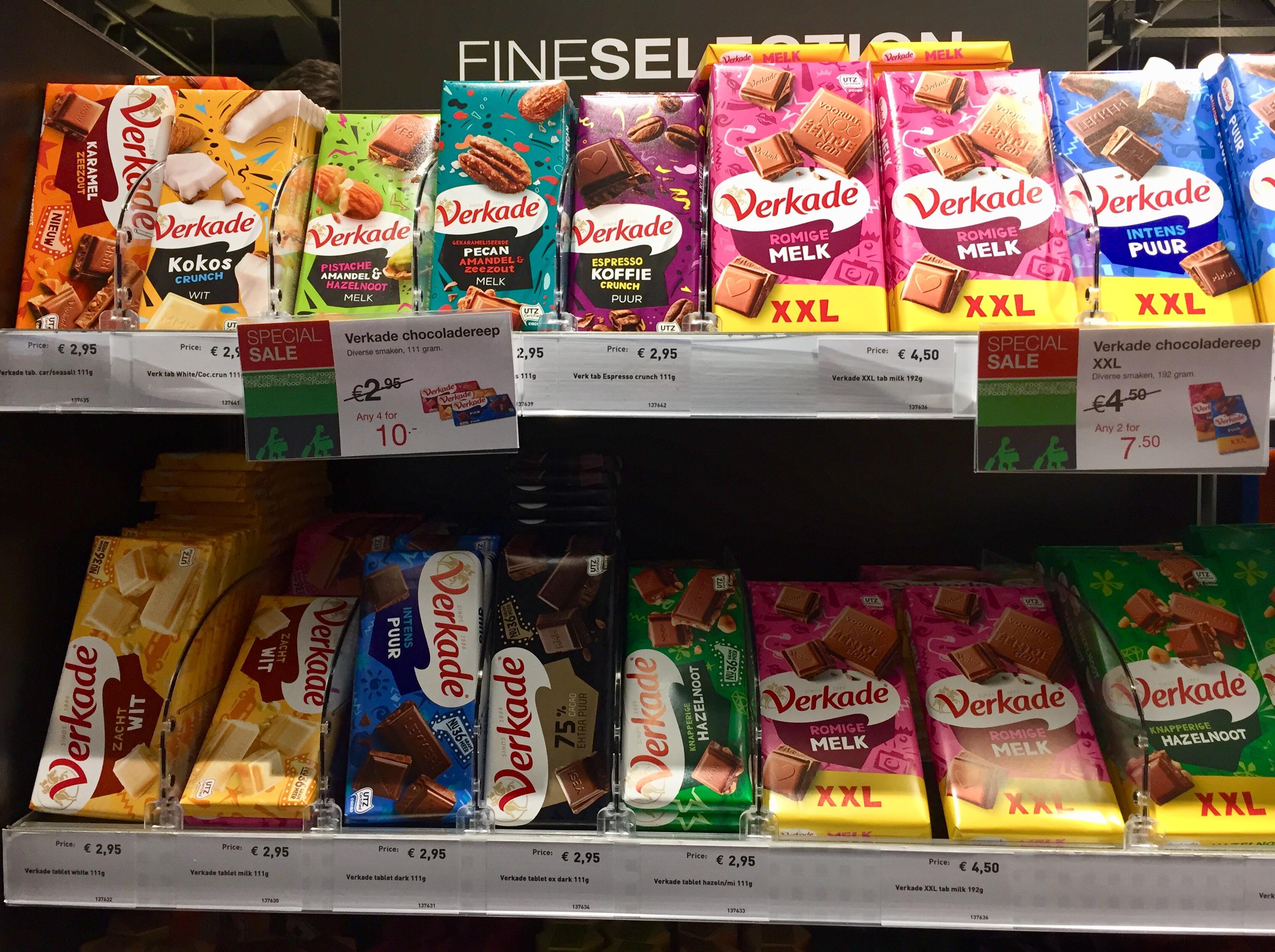
Join the Chocolate Party
Lots of design trends in chocolate right now, from craft maker to dark explorer, but Dutch traditional mainstream brand Verkade has decided to join the taste party. Funky, fun and old school, it just might be the right recipe to stage a comeback.
The Incredilabels
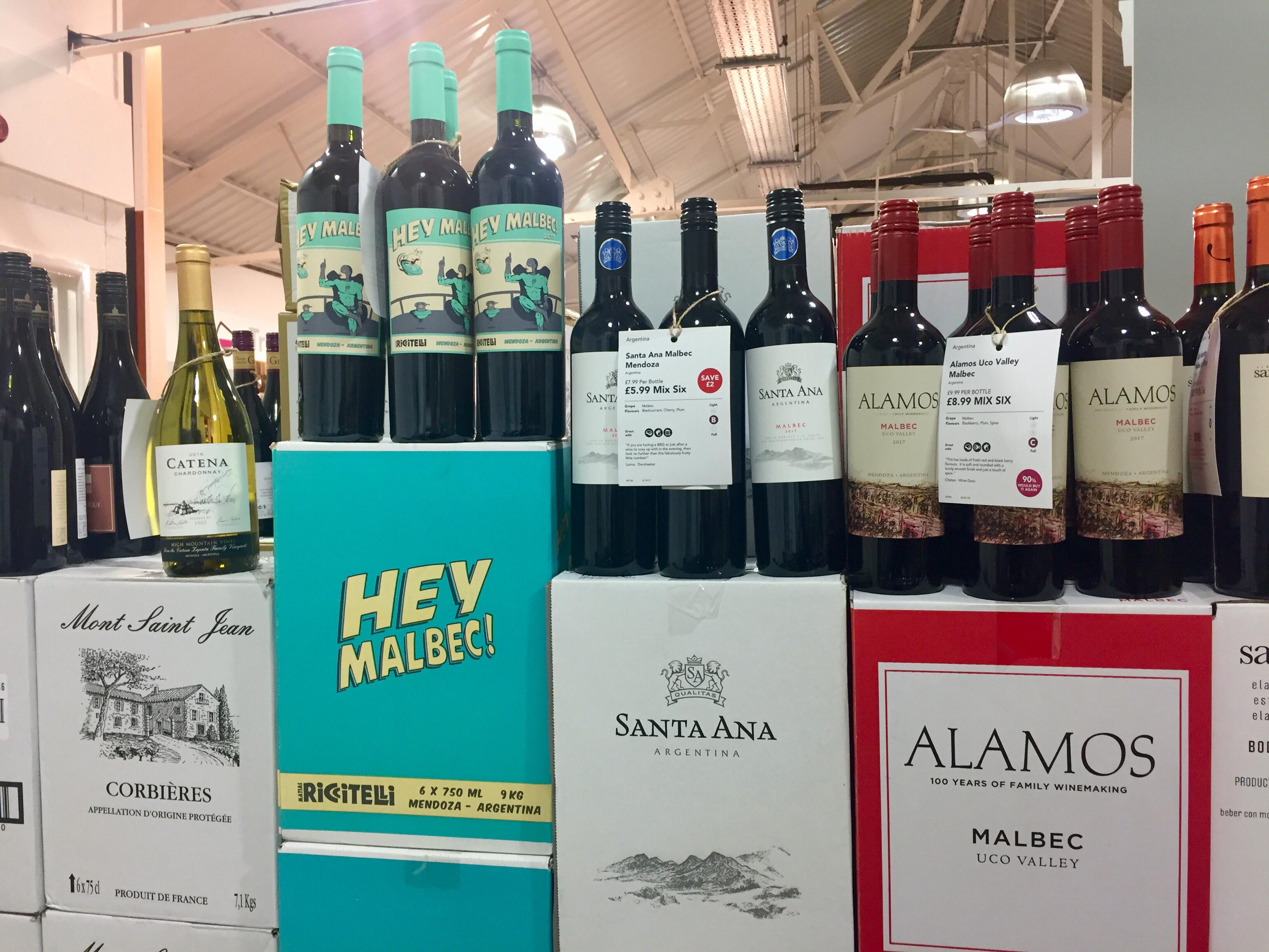
Wine labels – a conundrum for branding because arty one-off equals premium and desirable, whereas a sniff of a design system equals mass market plonk. This is where craft codes will change everything of course. Can’t say this Marvel comics graphic approach reassured me on quality, but ‘catch the eye’ it most certainly does!
On Target
Standing out isn’t rocket science, it’s about simplicity and brain-friendly signals like flat colour and recognisable shapes. Digital design is helping packaging learn the art of leaving out, but don’t forget to keep it distinctive (=branded).
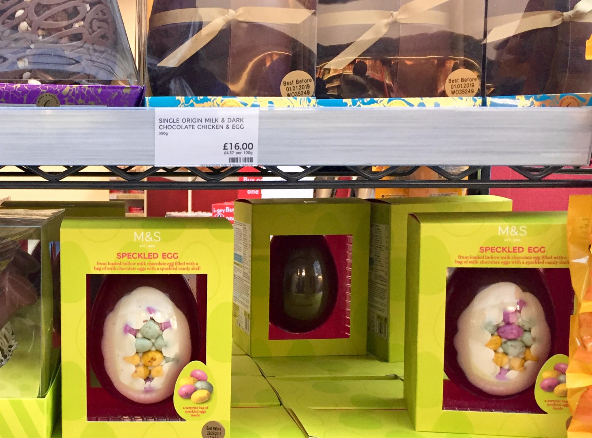
Bit of a Mouthful
‘Single Origin Milk & Dark Chocolate Chicken & Egg’, or ‘front-loaded hollow milk chocolate egg filled with a bag of milk chocolate eggs with a speckled candy shell’? I’d better ask my Lawyer – whatever happened to simple ‘Easter Eggs’?
Liquid Temptation
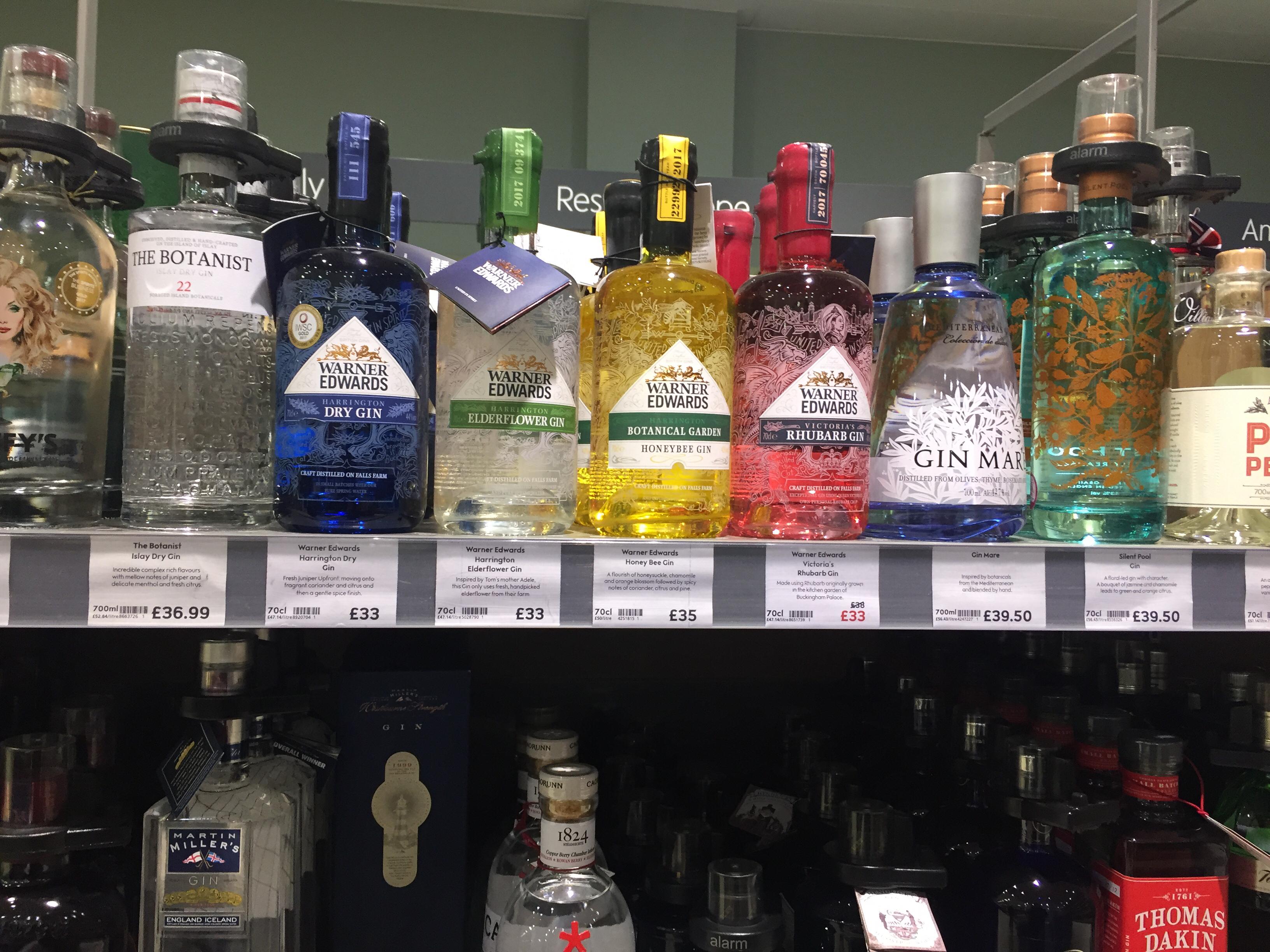
I like a challenge, so what are the design codes driving the impressive growth in gin? Apart from the dozens of ‘beautiful but generic’ designs I found about 5 successful territories for branded propositions. Here at the most expensive (top) shelf at Waitrose, it’s mostly ‘oversized perfume bottle’ making the running. This is not intended as an insult: it’s a perfectly fitting metaphor for a fragrant social lubricant.
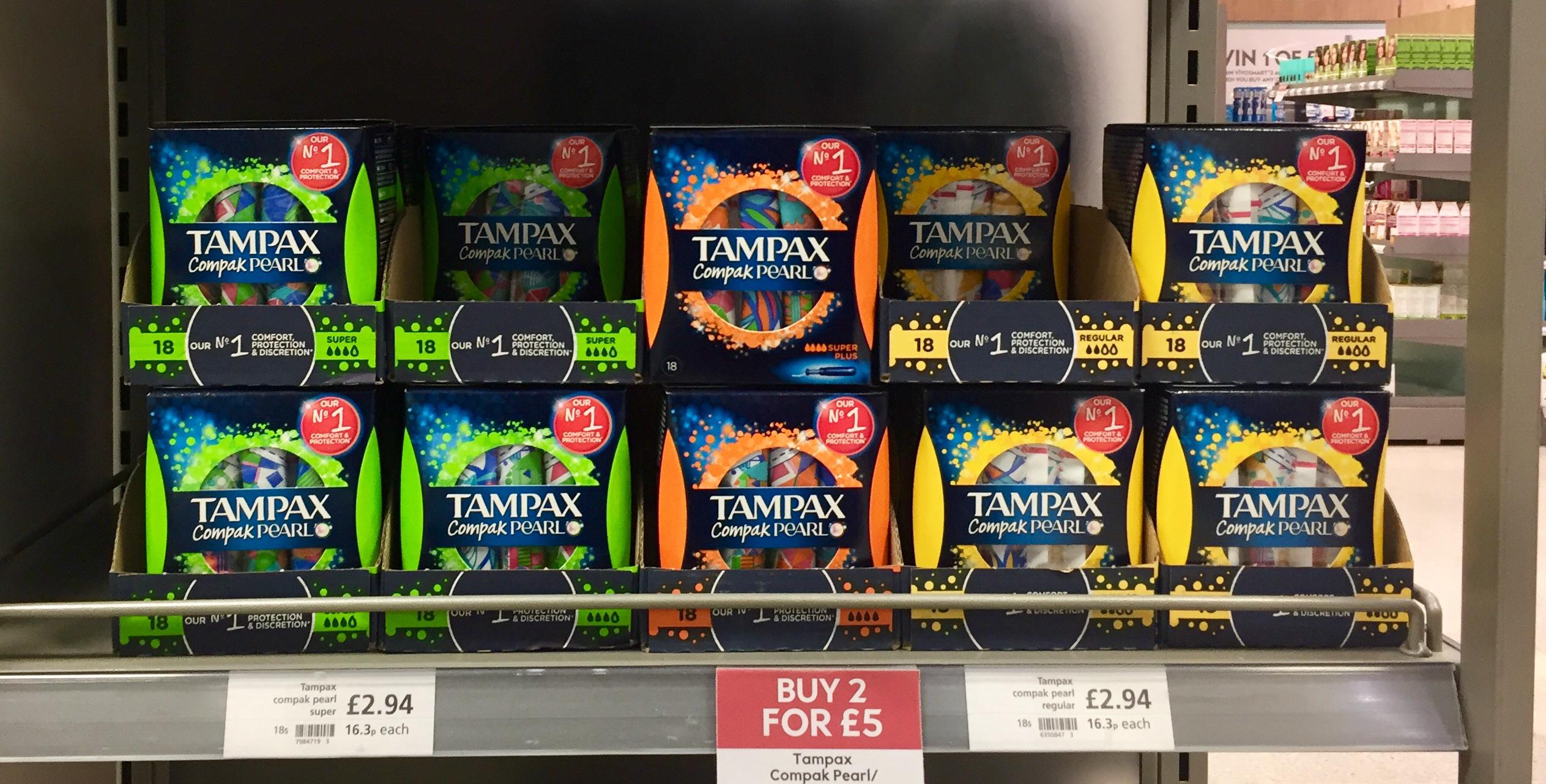
Loud and Proud
Wow! Tampons have come a long way since their main message was safety and effectiveness. Party Time! I’m sure there is an explanation, but I’m still scratching my head. Semioticians, over to you.
Mouldy cheese
Innovation. To succeed it needs one foot in familiarity, and one foot in surprise. Blacksticks is a blue cheese, already a minority sport. An Easter egg made of cheese. WTF!? When you mould chocolate, it stays chocolate, when you mould cheese… not so much. Sorry, way too much surprise.
