Naturally I’m biased, but it tends to make my day when I come across a piece of design work that makes me smile. Like a good joke well told, the smile happens when we ‘get’ the punchline, and the story is completed in a highly engaging way.
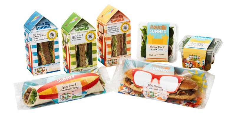
Sandwich brand Urban Eat actually made me laugh out loud when I chanced across its new packaging at Heathrow on Sunday morning – they’ve only gone and created a new ‘beach hut’ pack for their summer range…
According to industry authority The British Sandwich Association, The UK market for pre-packed sandwiches continues to grow and is now worth well over £7 billion per year. It also supports 300,000 jobs. Sandwich bars and coffee bars have over 40% of the market between them, four times the share of the supermarkets (though Marks & Spencer are credited with creating this market in 1980, 208 years after the Earl of Sandwich invented – and named – the product).
The average shopper buys 55 packs a year, with Scotland, The Midlands, Yorkshire, London and the South buying more than average. For a reason not explained in the report, the South West (where I live) is way behind the rest of the country, buying a measly 32 packs a year. Either we’re making them ourselves or filling up on pasties.
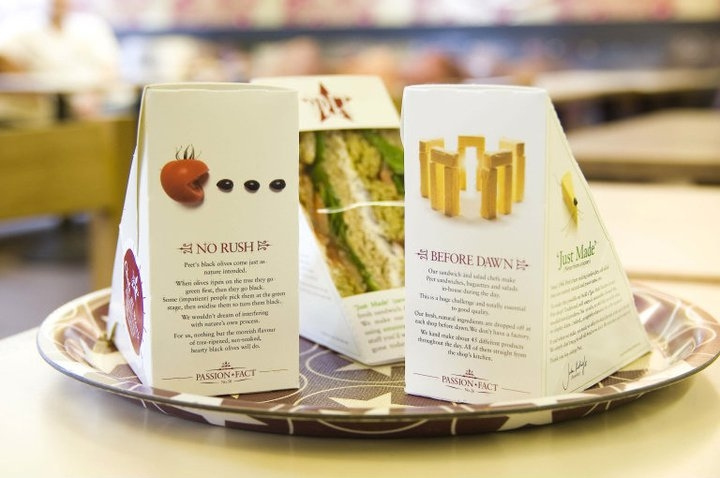
Such a huge and growing market attracts plenty of competition and it takes real innovation to stand out. Pret à Manger is a paragon amongst sandwich bar brands for both corporate and product innovation, with a full but constantly evolving range of gourmet sandwiches, salads, coffees, soft drinks, fruit, soups, etc. Equally importantly, they provide witty and in-depth communication of their commitment to food quality, freshness (‘Here today, gone today’) and good citizenship (such as giving away surplus stock to the homeless).
All of this storytelling elevates the brand value way beyond that of the product, fuelling profitability and customer loyalty. Well-designed product packaging that carries these messages lightly is an important medium for Pret, but the biggest hitters have to be the retail store (which I see as giant packaging in which the customer is part of the filling) and happy, well-trained staff.

It doesn’t come much better than this in Sandwich land, yet some people still choose Subway, a phenomenon worthy of a separate post.
But when you don’t control the retail environment the challenge is tougher. You need to tell all of your brand story on a small piece of packaging that also wants to show you the delicious product through a window, and prominently display nutritional information and best before dates, etc.
With such a small space the brand itself is crucial, and with ‘Urban Eat‘ we already have a good start. Whilst it has no rational meaning at all, just like another of my favourites Urban Fruit it kind of summons up the idea: ‘I have a busy but interesting life which means my food needs to be convenient, healthy and available in the big city’. You are what you eat, and I’m, er, urban…
But Urban Eat go further and offer several well-designed concepts like ‘Posh Nosh’, ‘Eat better’ and ‘No Fuss’, each signposting a specific ‘sub-need’ within sandwich occasions.

But what about a special summer range? We all eat just a little bit differently in summer, and even when average British temperatures rarely rise above 20 degrees, we love the idea, the story, the concept of summer.
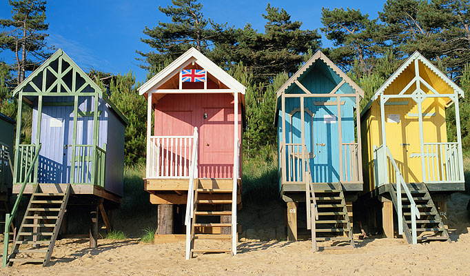
Can you name the top 3 iconic symbols of your favourite British summer? Depending on where and when you were brought up, these might include barbecues, strawberries, ice cream cones, deck chairs, Pimm’s and croquet mallets. Beach huts are a little more special interest, but just like red phone boxes you don’t need to have owned, used or even seen one to know how well they stand for everything it means to be British. Everyone knows a story about a beach hut 5 feet square selling for over a million pounds.
For many brands a picture of one would have been enough, but by choosing to design an inefficient yet charming box that reminds us of a fictional, idealised past, Urban Eat are at least doubling their storytelling power.

Success in branding is a case of winning the association game. Make sure your packaging is using all of its powers to communicate your BPS – brand positioning story.
Originally published on LinkedIn.


